DELANEY ALLEN IN NEW MEXICO

A piece from Delaney Allen's 2012 series, Painting a Portrait now on view at 516 ARTS in New Mexico. 

A piece from Delaney Allen's 2012 series, Painting a Portrait now on view at 516 ARTS in New Mexico. 

Delaney Allen's photographs are currently on view in Albuquerque, NM, in Future Tense at 516 ARTS. This is part of the PhotoSummer 2016 exhibition programming in partnership with the University of New Mexico Art Museum. Take a look at this great interview co-curator of the exhibition, Stefan Jennings Batista, recently did with Delaney about his work and participation in the show. 

CONGRATULATIONS TO WILLIAM MATHESON !

Sending our congratulations to William Matheson, who just completed his MFA at Virginia Commonwealth University! We are excited to share a few new paintings from William, and looking forward to seeing what the future holds.

William Matheson, Remus and Romulus, 2016, oil on canvas, 32 x 46"

William Matheson, Remus and Romulus, 2016, oil on canvas, 32 x 46"

William Matheson, Back and Weathered Glove with Pearl, 2016, oil on panel,10 x 8" each

William Matheson, Back and Weathered Glove with Pearl, 2016, oil on panel,10 x 8" each

FAVE3: LUSI

DELANEY ALLEN, 2.1 (Documentation of Landscape), 2016, archival pigment print, 30 x 20" 

DELANEY ALLEN, 2.1 (Documentation of Landscape), 2016, archival pigment print, 30 x 20" 

This is one of my favorite pieces of Delaney's because it is simultaneously so simple and so complex; I love the bright light in the foreground contrasted with the deep blues and shadows of the back. It is calm while maintaing the eerie and fantastical nature of Delaney's work. 

Tote bag by MODERNWOMEN LA, modeled by Emma 

Tote bag by MODERNWOMEN LA, modeled by Emma 

My go-to carry all tote that packs a punch. A perfect statement piece with some pretty empowering text on the front. We are nothing without feminist art! 

Maggie Nelson, Bluets, Wave Books, 2009

Maggie Nelson, Bluets, Wave Books, 2009

"I have enjoyed telling people that I am writing a book about blue without actually doing it." 

I'm on a roll here with blues and gender and Maggie Nelson's Bluets combines the best of both worlds. For me, this is one of those books that I picked up once and will carry with me for the rest of my life and am so happy we carry it in our shop. A must read. 

INTERVIEW: TY ENNIS

Gallery artist Ty Ennis discusses his current series Stupid Man with Assistant Director, Gabi Lewton-Leopold. Thanks for sharing your thoughts, Ty! 

Installation view of Stupid Man, on view through June 20, 2016

Installation view of Stupid Man, on view through June 20, 2016

Gabi Lewton-Leopold: In this new series, there’s a move away from your colorful works on paper that are often very detailed, to more abstract, mainly black and white acrylic paintings on canvas. What advantages did the latter medium give you? Why the shift in style and medium?

October 7th // Man Crushing the Dead, 2014, acrylic on paper, 15 x 11"

October 7th // Man Crushing the Dead, 2014, acrylic on paper, 15 x 11"

Ty Ennis: The advantage of the black and white acrylic was that I was able to work more loosely and I didn’t have to make color choices. With a small child and next to no studio time, I couldn’t rationalize spending hours simply deciding what colors I might use for a composition. I had also decided I was going to get back to basics with this work. I mean, High School basics, when painting was simple and free and fun and all the supplies were supplied by the school. I took it back even further and limited myself to just black and white. It was liberating. I was finding myself at work looking at the clock just dying for it to be time to clock out so I could get home and paint. I don’t remember that ever being the case with my studio practice. Art has always been a difficult endeavor for me. A real struggle. The style and medium choices allowed me to get more work out quicker, and I had agreed with myself to not be fussy but to just be myself, and if the piece I made on any given studio day was a keeper, but had some faults, we’d look at it later on and see if it was still needing adjustments. Almost every piece was set aside and in the end, I had grown to love each and everyone of them just as they were. This was a truly magical studio experience for me. Like I said, liberating.

GLL: What was the first painting you made for this series? 

TE: The first painting I produced for this show was a portrait of Ken Griffey Jr. It did not make the show, but served as my studio mascot.

The Kid, 2015, acrylic on canvas, 10 x 8"

The Kid, 2015, acrylic on canvas, 10 x 8"

GLL: I find something deceptively effortless (and I mean this in a positive way) about the work, a looseness, a sense of freedom. But when you really examine closely, you can feel how thoughtful and well-crafted they are. For example, the heron in The Clairvoyant. It’s composed of loose brush strokes but it’s so well-rendered and captures the serene and quiet beauty of the bird. Or, the cleverly obscured rabbit holding a tray in Zip's Drive In. What's your process like? Do you make sketches, and plans for each painting or is it more spontaneous?

The Clairvoyant (Blue Heron), 2016 , acrylic on canvas, 16 x 12”

The Clairvoyant (Blue Heron), 2016 , acrylic on canvas, 16 x 12”

TE: I never do sketches and I don’t say that in a “I don’t need to” sort of way. I often find that if I sketch something out, I have difficulty in reproducing it and get all caught up in loving the sketch more than the piece itself. So, I avoid it completely. The heron came easy, the rabbit was the result of absolute frustration. So, I guess I approach each canvas with my fingers crossed.

Zip's Drive In, 2016, acrylic on canvas, 10 x 8"

Zip's Drive In, 2016, acrylic on canvas, 10 x 8"

GLL: Does your printmaking background inform your painting practice? Do you think there’s a relationship between the two or do you see them as completely different methods? (also interesting that you painted a version of the Goya print)

Goya, Capricho No. 4: El de la rollona (Nanny's Boy), 1799, etching, aquatint, drypoint

Goya, Capricho No. 4: El de la rollona (Nanny's Boy), 1799, etching, aquatint, drypoint

TE: Printmaking absolutely informs my work and even though I haven't set foot in a print studio in more than a decade, most of what I know about art I learned from printmakers: Tom Prochaska, Yoshi Kitai, Jayson Wynkoop, and Emily Ginsberg. 
I work in layers like a screen printer and from light to dark like an etcher. In the past when working on paper, it has been difficult, with ink, to go back in and rework things, pen or brush moves are much more deliberate. With acrylic on canvas, I feel I have unlimited moves. A painting is never ruined and prints so easily are. You go back into a drawing or print and paint something out and you just highlight your imperfections. Some of these paintings in this show are paintings on top of paintings. Hell, Iggy Papa is a painting on top of a painting on top of a painting on top of a painting. And yes, I love that Goya print so much! It’s an example of a perfect piece of art in my opinion. It resonates with me deeply and on many levels and since the first time I saw it back in a history of printmaking class I took with Morgan Walker at the Gilkey Center at PAM fifteen years ago, the image has just been clawing at me. I finally let him/her out. There are a few “covers” in this show. El de la rollona is one of them.

El de la rollona (Mama’s Boy // After Goya), 2016, acrylic on canvas, 10 x 8"

El de la rollona (Mama’s Boy // After Goya), 2016, acrylic on canvas, 10 x 8"

GLL: Can you talk more about your process for deciding on specific imagery for this series? We’ve got the gingerbread man, Sam Sheepdog, Iggy Pop, and so forth. Do they represent important influences on your life? Do you see them as symbols or relics from your past?

TE: I said earlier that I don’t do sketches. Instead, I take a lot of notes, I write things down on post-its and type ideas into my phone. With that information, I start to see patterns and recognize reoccurrences. From there the information starts to grow and become more concrete in my mind and I start to visualize how things “might” look. It all starts to act as a daisy chain, where the images/ideas begin to play off of one another and start the process of becoming one unified composition/show. There is always a common thread. With that being said—and hopefully not further confusing the matter—the characters I chose to present are all characters I have a deep connection to. They could have all be titled as Self Portraits really. I did a series of gingerbread man drawings a few years back for a project with Matthew Kyba.

Untitled, 2014, graphite and ink on paper, 7 x 5"

Untitled, 2014, graphite and ink on paper, 7 x 5"

They really did feel like self portraits at the time, so naive, dumb, waving, and vulnerable. I was feeling really bad about myself at that time and this little figurine May had bought me was really mirroring my emotions. Sam Sheepdog is an old Looney Tunes character that clocks-in each day to go head-to-head with Ralph Wolf, who is essentially Wile E. Coyote. They greet each other in the morning... ”Mornin’ Sam” “Mornin’ Ralph”... and then put on their daily performance, Sam continually catching and punishing Ralph, in his attempts to get the sheep Sam protects. At the end of the day, they clock out and a new dog and a new coyote relieve them. I was thinking a lot about work here and the way in which I show up every morning as my “work-self” and put on a performance of sorts. I play a dumbed-down version of myself day-in and day-out, so I can come home to my family and my studio where I can actually be my true self again.

Clocked In (Sam Sheepdog), 2016, acrylic on canvas, 14 x 11"

Clocked In (Sam Sheepdog), 2016, acrylic on canvas, 14 x 11"

GLL: This new series also has many obscured faces (Iggy Papa, La Buffoon, Cowboy Shadows, El de la rollona, Clocked In (Sam Sheepdog), etc). Your subjects almost become more mysterious, and perhaps less specific because of this. Can you talk about your thinking behind the faces in the show?

TE: Once again I’ll refer to the Ken Griffey Jr. piece that is not in the show. In the very early stages of this body of work, I was working on drawing Ken Griffey Jr.’s Upper Deck rookie card from memory. An exercise to simply get me back into practice, I drew a handful of them in ink on paper and then decided that I liked the image so much I should paint a final version on canvas. I did this portrait in black and white and then hung it on the wall of my studio. I had put so much time and energy into this one piece that I kind of returned to point A and really had no idea what direction the work might go. Portraits of childhood heroes or portraits of present day heroes? I did a large colorful portrait of Charlie Parker on paper and another portrait of Griffey playing in the field and again, was right back to point A. I was listening to Lou Reed’s The Bells a lot in the studio at this point and decided that I was going to do a portrait of Lou Reed from that record’s cover, straight up in black and white just like the Griffey one. I hung it on the wall next to the Griffey painting and I had my first two paintings. Only problem being, they had NO soul. I kept coming back, seeing these paintings and just kind of dying of boredom. I took the Lou Reed painting and masked his face behind fishnet. I kind of liked it. I kind of hated it. I got frustrated and just ruined it. I blacked it out. I thought back to my last show, JKJKJK, and remembered the crude figures from that show and some of the textures I was getting from working loosely, and a light bulb went off. I remembered how much I loved working on them as well and decided that was the direction I was going to take with this work. 

Man with Monkey (L) & Spanker (R) from JKJKJK, 2012

Man with Monkey (L) & Spanker (R) from JKJKJK, 2012

I painted Lou Reed’s face in this fashion and he was no longer Lou Reed, he was a reflection of my own frustrated self and the painting now had enormous weight and things came very freely. The plan became to be myself. I’m not a portrait painter. I’m not an illustrator. I’m a painter. With this show especially, I wanted to be a painter. I took the Griffey piece down from the wall and extracted a whole tube of violet paint across his eyes, the eyes that I had just spent hours getting perfect. And somehow, it brought the dead painting to life. For me, at least.

La Buffoon, 2016, acrylic on canvas, 10 x 8"

La Buffoon, 2016, acrylic on canvas, 10 x 8"

GLL: You often draw imagery from your childhood growing up in Spokane, WA. How has it influenced this series? 

TE: Spokane is a merit badge I wear. The heron, the cowboy, the buck skinner, the fast food rabbit, they are all icons from my own personal experience. My own upbringing. In talking about Sam Sheepdog and my day job where I put on this act of portraying my work-self, what comes with that is also this realization while working with large groups of people that I don’t have many common interests with my co-workers, we don’t recall the same things from our youth from living on the same earth for roughly the same amount of years. I’ve seen so many instances where two, three, four, five people just mesh. You set them at a table and they have these long conversations where their recollections from childhood are almost synchronized. I’ve come to realize that with my co-workers I like some of the same music, but I can never remember the movies from the 80’s and 90’s that are quoted, I can’t join in on the Star Wars conversations that happen, far too often by the way, and I can’t relate with most people’s travel stories. My childhood was spent in Spokane and inside my own head, daydreaming, wandering. I had interests of course, I skateboarded and played baseball and ice hockey, I read, listened to music, I watched movies, but I didn’t retain much from any of these things. I could write a novel about listening to Pearl Jam Ten in sixth grade or Wu-Tang in the eighth and all of the places in which I listened to them, but I can’t recite more than three or four lines from either, and I listened to them a lot. A lot. And Wu-Tang I still do. Same goes for Elliott Smith and his albums later on into college. From all of these experiences, what I have retained are the experiences themselves. Little vignettes where the music served as a soundtrack. That doesn’t translate into a universal conversation that you can bring to a table, it’s way too personal. This has isolated me. It has made me unique, I suppose, but ultimately, lonely. Spokane was my WORLD. I can’t help but return to it when I sit down and try to process things or express myself. It’s the stage everything played out on for me. I know myself. I know Spokane. I don’t know much else. I think a person’s place of upbringing is monumentally important. I recently read that Ingmar Bergman once stated that regardless of where he was born and raised he would still be the Ingmar Bergman we know. That’s bullshit.

GLL: Much of this work and your past work, is deeply personal and seems to grapple with ideas and perhaps misconceptions on what it means to be a MAN. How does masculinity and the struggle for finding that identity play into this work?

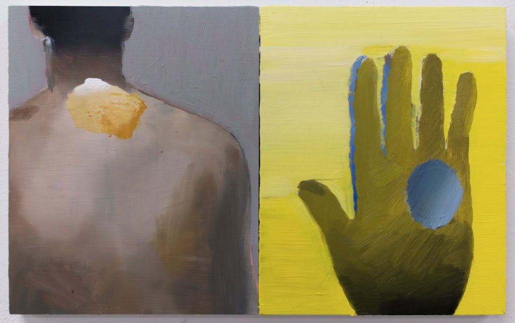
TE: It’s a tough subject for me to talk about. That’s probably why it comes up in my work so often. My work is where my most intimate and personal conversations take place and they’re still encrypted. I’m 35 years old and I’m still learning how to speak. I read a lot, I surround myself with our language, I try to immerse myself in it so that I can express myself clearly and eloquently. I want to SPEAK. But, I just trip on my tongue. I think I grew up with a learning disability that I was completely unaware of. I don’t have a clear and tight grasp on things. So much of being a MAN is being able to communicate clearly, stand up for yourself, set good examples, and be strong in the process. To inspire. Then there’s this other aspect where you have to be physically strong and good with your hands and not make mistakes. You have to be witty and on point. A good MAN can’t ask questions. He has to know the answers. He’s gotta be in tune with nature and know how to tie all of the knots. Set up a camp. Dig himself out of snowdrift. Swim himself to safety. He has to be good with power tools and automotive shit. He has to protect himself and his family and not show sweat. He’s gotta be prepared for the big one. He has to fend off intruders. The list goes on and on and on. And each of these things has to be handled with the utmost confidence. My understanding, is that in our society, if you’re not into certain things and don’t know certain things, then you’re not a man, and I’m left feeling unmanly all of the time. My masculinity is challenged daily. I’m still getting bullied at 35 on a regular basis. My work is from the perspective of the flashlight holder.

GLL: I think that comes through because along with that idea of masculinity there is also a softness, a tenderness and even a sense of humor to this series that seems to counter that need to be a “tough guy.” It also feels personal and universal at the same time.

TE: We need to laugh more. We need to laugh at the “tough guy” more. Fuck the tough guys. It has gone too far, they’ve had their turn. My daughter lately has been telling me, “Be happy, Papa!” I have no idea where she got this, but seriously, happiness needs to be the universal theme. It’s got to be. 

GLL: There are big vinyl letters on the wall that say your name and then “Stupid Man” below. Can you talk about the title Stupid Man? Is it meant to be self-deprecating?

TE: Yes and no. I have low self esteem, I’m insecure, I suffer from social anxiety, I grew up wetting my bed and sucking my thumb. I was called a pussy and a fag a lot as a child and even when I first moved here to Portland in ’99 I had people yell, “fags” at my roommate and I from their car window as we walked down the street. I’ve never felt masculine or manly in the slightest. I have always been afraid of men and feel that my work comes from my feminine side. I guess none of this has to do with being “stupid,” but it has to do with being misunderstood and judged. I mentioned earlier that I often trip over my tongue. I am not comfortable with the words that come out of my mouth a lot of times. I feel I poorly represent myself with my speech. I don’t have a large vocabulary and my dictionary app is my best friend. You would be surprised by some of the words I’ve looked up over the last six months. I know that I am not, but I often feel stupid. My geography, world history, and politics are bad, I am working on these things now at 35, because none of it stuck in my teens. I feel behind. In addition to all of this, my heroes are intellectual, activist types. The ones that stand up for themselves, liberate themselves. Iggy Pop and Lou Reed, who both appear in this show for example. They embrace their femininity and give the middle finger to the Man’s man. Last summer, when I had finally figured out where this show was going and what themes I was working with, when I was actually able to envision how this work might appear, May and I were at our friends’ house for dinner and The Bells came on. It begins with the track Stupid Man. A beautiful song about a deadbeat dad that only Lou Reed could write. I remember as it came on telling May that my show was going to be titled Stupid Man, and we just laughed.

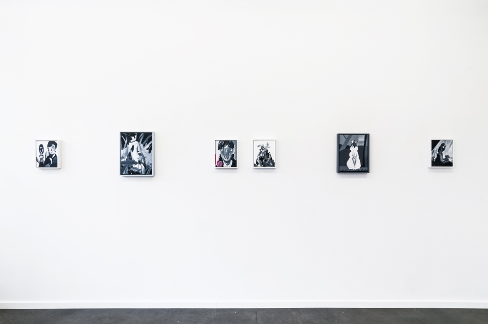
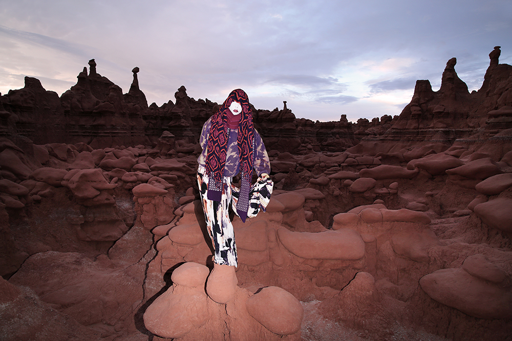
GLL: You showed two studies or “failed” paintings during our group studies show in February. One was of a woman (though the canvas was sliced down the middle) in a long dress and heels. After thinking about that piece I realized that there are no images of women in the final show. Was that a conscious decision to remove the female subjects to focus on notions of masculinity?

Study for Woman with Black Gloves, 2015, acrylic on canvas, 14 x 11"

Study for Woman with Black Gloves, 2015, acrylic on canvas, 14 x 11"

TE: You know, the figures in this show with their distorted faces and sexually cross-dressed attire are for the most part sexless. Only the buck skinner is a man, and that piece is from the perspective of the deer really, or the sickened child as the man’s spectator. In Cowboy Shadows, the real protagonist is the shadow. Those paintings are apologies of sorts to my father. And in other ways to my girlfriend and our daughter. I’m sorry I can’t be the Man that they might sometimes call upon. I’m sorry I was never able to impress my father or get his attention and that, as a result, that relationship fell flat. That my daughter has no grandfather as a consequence. It’s okay though, I’ve learned to live with it. Those conversations with her are going to be very difficult though. The figures in this show, Lou Reed and Iggy Pop, they seem to have similar takes as mine on the subject of masculinity and I don’t think they would take any offense as being seen as women. There are no MEN in this show.

Mick Rock, Bowie, Iggy and Lou, Dorchester Hotel, 1972

Mick Rock, Bowie, Iggy and Lou, Dorchester Hotel, 1972

TY ENNIS // CLOSING RECEPTION & CATALOG RELEASE PARTY

If you haven't yet had a chance to catch Stupid Man, stop by this Saturday 5:30 - 7:00 for a mellow closing reception. We will also be releasing NATIONALE19, the exhibition catalog which includes an essay by Daniel Kine.


STUPID MAN by DANIEL KINE

Simplicity involves unburdening one’s life. Errors, oversights, the language of critics. In defining a painting, one takes shots at defining the human experience. Failure, imperfection, hindrance. An honest painting is a reproduction of life, not a reproduction of art. Memory, object association, stories overheard or remembered or interpreted—often void of color or ostensible detail. 

The shift away from the perceptual, or the ability to interpret or become aware of something via the senses, is a modicum of insight into the 21st century experience. The twenty-four hour news cycle, the forty-hour work week, the filtered fifteen-second video. One is just as likely to witness footage from a plane crash on a pay-screen in the backseat of a taxi or on a muted television in a laundromat as they are to encounter an acquaintance in the street. And yet a distortion of reality does not take away from what is real. Perception is not malleable, even if reality is. 

The following collection of paintings were produced loosely, in a rapid manner, with very few materials. They represent development via the act of unburdening; adaption via restraint. Not a return, but a progression. A demonstration not in simplicity, but restriction. Their lack of color and ostensible detail leave one with the impression of an almost Eastern discipline. Pieces like The Clairvoyant (Blue Heron) and Buck Skinner exhibit an interrelation of shade and shape that seem to speak more to cognizance and memory than to image. And yet nothing is lost here. Rather, something veritable is gained through the artist’s demonstrable control. Comedy (Grandma’s Laughing Eskimo) & Tragedy (Grandma’s Crying Eskimo), more like found objects or abrupt memories, serve as an almost Proustian aide to remembrance or loss. The dreamlike quality of interpretation. The intimacy of subjectivity. 

As a whole, Stupid Man is a mingling of veiled emotions, representations and elusive, uneasy figures. Ennis’ subjects are an analysis of memory, experience. Representations not of subjects or forms or applied methods, but of sentiments. The impetuosity of youth. The obstruction of time. The burden of resolve.

DK
New York, May 2016


Daniel Kine is the author of the novels Between Nowhere and Happiness (2009, Smallhand Press) and Up Nights (2013, Ooligan Press). He was born in Toledo, OH, in 1984, and studied philosophy and literature in San Francisco, Mexico City, Guatemala, and Portland, OR. His writing has appeared in several publications, including Modern Review, Q Poetry, Pathways, and Indie Literature Now. Kine lives in Brooklyn, NY.

This essay was commissioned for the exhibition catalog accompanying Stupid Man and funded by the Regional Arts and Culture Council.

TY ENNIS // STUPID MAN

Stupid Man by Ty Ennis, on view through June 20, 2016 (images Mario Gallucci Studio)

Stupid Man by Ty Ennis, on view through June 20, 2016 (images Mario Gallucci Studio)

Clocked In (Sam Sheepdog), 2016, acrylic on canvas, 14 x 11”

Clocked In (Sam Sheepdog), 2016, acrylic on canvas, 14 x 11”

El de la rollona (Mama’s Boy // After Goya), 2016, acrylic on canvas, 14 x 11”

El de la rollona (Mama’s Boy // After Goya), 2016, acrylic on canvas, 14 x 11”

Iggy Papa, 2016, acrylic on canvas, 10 x 8"

Iggy Papa, 2016, acrylic on canvas, 10 x 8"

On view May 13–June 20, 2016
Opening reception Sunday, May 15 (3–6PM)
Closing reception & catalog release party Saturday, June 18 (5:30–7PM)

For his second solo exhibition at Nationale, Ty Ennis presents Stupid Man, a series of small black & white paintings that explore his present day-to-day life as an artist and young father with a full-time day job. Like most of his past work, they tell individual stories that are all part of a larger narrative. This new body of work, in its loose composition and black and white presentation, adds a more raw and stripped down layer to the ongoing monologue which has been the crux of Ennis’s work for the past twelve years. Although deeply personal and intimate, Stupid Man ultimately explores themes that inspire and challenge us all. 

Ty Ennis (born 1981, Spokane, WA) lives and works in Portland, OR, where he graduated from Pacific Northwest College of Art in 2003 with a BFA in Printmaking. His work was previously included in the 2006 Oregon Biennial at the Portland Art Museum. He has exhibited across Portland at Nationale, Open Gallery, New American Art Union, Pulliam Deffenbaugh, and the Art Gym at Marylhurst University; in Seattle, WA, at Prole Drift; and in Los Angeles, CA, at William H Bothy. Ennis is the recent recipient of a Project Grant from the Regional Arts & Culture Council and a Career Opportunity Grant from the Oregon Arts Commission. He joined Nationale as a represented artist in the spring of 2013.

This project was funded in part by the Regional Arts & Culture Council

INTERVIEW: DELANEY ALLEN

We recently caught up with Delaney Allen to discuss his current show A R T I F A C T  now on view at Nationale through May 9, 2016. 

Gabi Lewton-Leopold: Your current series A R T I F A C T takes on many themes and subjects, from costumed self-portraits to dramatic landscapes. Although we’ve seen these elements before in your earlier projects, there seems to be a deliberate move towards artifice and manipulation—digital collage, use of a green screen—within these images. Is digital alteration important to the series and to the overarching narrative?

Delaney Allen, Figure 1.14 (Self Portrait), 2016

Delaney Allen: Upon first examination, the intention is for one to enter into this world with a sense of mystery or bewilderment. Acting as a larger, overarching theme, the creation of something unknown, yet familiar, exists throughout A R T I F A C T. Manipulation is present but is a lesser, casual theme.

Speaking more towards manipulation, those devices were tools that I used like the application of camera itself. Utilizing those elements granted me the means to further the series in the way in which I am accustomed to working—individually without assistants (on location or in the studio). It also allowed the installation of new characters into the body of work, dissuading possible repetitiveness from reoccurring throughout. Those small facial glimpses were important, but the factors into their creation were less so. Once that revelation of digital manipulation is known concerning the creation of some imagery, the viewer can change their approach to the series. Eventually, that investigation and process came more as a means to problem solving and expansion than anything else.

GLL: Art historical references come across in the series—images referencing Dutch still life, Cubism, Dada, and Surrealism, among other influences. How do you see this work in relation to these movements of the past? 

DA: I referenced those movements as I began to frame the series. They were specifically key in building the still life imagery. When still life painting began, as in the early Dutch paintings, it started with flowers or kitchen items laid out on the table. At that point, they were referred to as fruit or flower pieces. With that, it became vital to adopt the idea into A R T I F A C T to lay the groundwork for building the fictional history. 

Figure 3.2Figure 3.3, and Figure 3.8 were direct responses to that early investigation. But with those familiar elements in place, I looked to move beyond a direct acknowledgment, feeling a need to blur the lines of art history. Figures 3.2 and 3.3, at least to me, show tendencies towards Cubism specifically.

Delaney Allen, Figure 3.2 (Still Life), 2016
Delaney Allen, Figure 3.3 (Still Life), 2016

Pablo Picasso’s still life, Mandolin and Guitar became a prominent fixture of reference when I began to dissect the images and build them back up again in the frame. Looking at Mandolin and Guitar, one can identify the similarities within my still lifes as I attempted to flatten and distance portions of the images. The same can be found in Figure 3.8 and its association with paintings like Georges Braque’s The Studio (Vase before a Window).

Pablo Picasso, Mandolin and Guitar, 1924

Georges Braque, The Studio (Vase before a Window)1939

Using mundane objects found within the studio, Figure 3.8 emulates the Cubist manner of breaking up and flattening of the image through color and line.

Delaney Allen, Figure 3.8 (Still Life), 2016

At the same time, those photographs, as well as others throughout the series, pull from the “New Formalism” movement occurring in photography at the moment. Artists such as Lucas Blalock and Daniel Gordon became aides when needing to look away from what one might consider straight photography. Although most New Formalism photographers give away their hand at play, I collected the ideas that their work is based on and implemented those in a less detectable way. While their photographs typically display the use of digital editing, I tried to minimize the moments in which I gave details away using similar processes.

Lucas Blalock, Strawberries (Fresh Forever), 2014

GLL: In many of your studio self-portraits, which are often filled with layered and textured fabrics, you allow us to see the materials used to create the work—tape, unprinted edges of fabric, the studio wall, your foot peeking out beneath fabric, and so forth. These moments take us out of the fantasy and expose the process. Why do you choose to include these elements? 

DA: With the studio portraits, I implemented certain elements and techniques when producing the work. Those components range from the flattening of the subject into sections of the background, veiling or masking occurring that mimicked some of the more abstracted landscape photography in the series, digital manipulation and smaller moments exposing the process like you mentioned. With the disclosure of those smaller moments specifically, my intention was to show the artist's hand in a way that would possibly direct the audience, at times, to questioning what they are seeing.

Beginning with the title of the work—A R T I F A C T—my objective was to build this fictitious community and history. But playing off the ideas of fact versus fiction, and even more pointedly, the belief in the history of photography that what we view is truth, I aimed for entry points that could allow for a sense of confusion or questioning that authenticity. We’re naturally taught to believe what is placed in front of us is truth. Knowing this, I purposefully designed and executed small giveaways hidden throughout the series that could discount that idea.

Delaney Allen, Figure 1.10 (Self Portrait), 2016

Expanding beyond the self portraits, these elements develop throughout the body of work. Still life images mixed physical and digital manipulation. Photographs would be dissected, at times applying new affects through rephotographing the imagery before doing any digital manipulation. Figure 3.4 exists completely as a level of manipulation to Figure 3.3

Delaney Allen, Figure 3.4 (Still Life), 2016
Delaney Allen, Figure 3.3 (Still Life), 2016

The image is solely a layer built in Photoshop that was applied to the still life. With its inclusion, it references that artist's hand previously mentioned. Landscape images contain these components as well. Paint applied in post-work allowed me, as the artist, to further control the environment that I built, as well as giving clues into the unnatural world that was assembled. Ultimately, what is displayed as fact will contain an either sizable or minuscule fiction.

GLL: Self-portraiture has long been a strong theme in your work. You’ve done so much to hide yourself, from covering your face in fabric, to now, in this current series, actually superimposing another face on your body. I can really feel the tension between presence and erasure of the artist within A R T I F A C T. What are your thoughts on the importance of self-portraiture within your practice? 

Delaney Allen, Self Portrait No. 1, 2011

Delaney Allen, Figure 1.6 (Self Portrait), 2016

DA: The importance of self-portraiture is huge in my approach to making. Dating back to when I was introduced to French auteur theory as an undergraduate studying film, I found issues with the amount of authority and collaboration in film and who, ultimately, could control aspects of the final product. I slowly began the shift away from filmmaking and towards photography, eventually settling on the mindset that self-portraiture, to me, is a truer form of individual art-making.

Who ultimately owns a photograph in regard to its finalized outcome? When considering portrait photography, does the truth lie on the sitter or the photographer, or does a combination lead to a partnership? Questioning these involvements within photography has been the root of how I fashion my practice, specifically in my handling of portraiture. With A R T I F A C T, the management of the sitter/photographer issue led the work to a slight blurring of lines when incorporating new approaches and techniques. Spending months scouring various fashion magazines, I amassed dozens of assorted aspects of the human body with the idea of assimilating them into the series. Ultimately building this fantasy-driven community from scratch using my frame as a template. With this unique approach, I retained control of the figure while allowing the slight, unveiled components to build individual portraits for the series.

As mentioned, with the presence and erasure of the artist, the concept of blending found imagery with self-portraiture granted the series the illusion of a society built out of the artist. If I explicitly used myself, my facial features in each portrait, A R T I F A C T would have suffered a limited narrative, failing to root the viewer in the environment. Purposely masking figures, incorporating others faces and collaging of images, allowed for a development within my particular history of self-portraiture.

GLL: Along with self-portraiture, the natural world is a consistent subject as well. At times they act as contrasting elements, and in other images they meet (specifically in Figure 1.1Figure 1.3Figure 1.14). What are your thoughts on how these different subjects coalesce in one body of work? 

DA: It was predetermined while scouting and shooting to pursue and demonstrate, through scenery, the themes constructed around the series. The inclusion of the abstracted photographs mimic the shrouding apparent within the portrait work. Shot in Oregon, California, and Texas, images such as Figure 2.6 contribute to the collapsed frame, allowing for a disorientation apparent in the work. Although working in a more straight photography means, A R T I F A C T ’s abstracted landscapes place the viewer into the unfamiliar with slight, albeit abstruse, glimpses into the perceived world.

To a lesser degree, the series further recognizes the imaginative world through Figure 2.3 and Figure 2.11. The inclusion of these two images deliberately presents a broader look into nature, fighting against the disorientation of the other images and giving pause within the work. Each image, photographed in Utah and Wyoming, were investigated for their unworldly look, and ultimately implemented into the creation showcasing a more vast look into the perceived world.

Delaney Allen, Figure 2.3 (Documentation of Landscape), 2016

Actualizing the addition of self-portraiture into natural scenes acted as the biggest strengthening for the series as the editing process began. These images, like you mention with Figure 1.1, 1.3, and 1.14, were thought to be the foundation of the work when I began the series. This endeavor was crucial to the development of a conceivable world connecting and uniting the images as a whole. Necessary to the evolution of building a history, these photographs were first generated as varying landscape imagery sans figures. Shot at dusk or night while traveling throughout the deserts of the Western US, experimentation with flash photography’s effects within the frame, led to the materialization of the final images. After collecting photographs shot in nature during various trips, I moved into the studio to photograph each figure that would ultimately resolve my initial vision. The incorporation of each figure into the selected backgrounds supplemented the series, securing constructed, snapshot-like photographs lending plausibility to the group of people.

Delaney Allen, Figure 1.3 (Self Portrait), 2016

GLL: We’ve seen the inclusion of sculptural elements in this show and Getting Lost in 2014. What was the initial impetus for going this direction? Do you have plans to go even further towards installation-based work?  

Delaney Allen, Figure 4.3, 2016

DA: That specific direction was a challenge I set for myself at the start of the new work. From my first series in 2010, until now with A R T I F A C T, I’ve tried to include a minor twist in my approach, creation, and completion of each body of work. I wanted to add to my toolbox as an artist with the inclusion of sculptural and painting elements. I needed that test to decipher something different.

At times, it feels artists can become stagnant in their growth as makers. We make a new series, some success or recognition comes, and we either feel comfortable with reapplying that approach, or are fearful to probe and develop beyond that. I assess each new series with a mindset that the application of an unexpected element, can and should arise, confronting the artist as well as the audience. With A R T I F A C T specifically, it moves beyond just the sculptures and paintings to include the understanding of digital editing, and ultimately an understanding of myself. Can I make these images I’m seeing in my head a reality with the incorporation of editing techniques I’ve never tried? Am I comfortable wandering into the woods alone at night for a photograph? Will waiting until the sun sets in the middle of the desert enable me to get the picture I’m envisioning even though I’ll be hiking back to the car in the dark? The entirety of these elements led me, I feel, to making the most challenging work I have to this point in my career. With that being said, I would expect for each subsequent body of work to examine these issues again. At the moment, I can’t see having a straight sculpture-based show in the future (but don’t hold me to that).

Delaney Allen, Figure 1.5 (Self Portrait), 2016
Delaney Allen, Figure 3.7 (Still Life), 2016
Delaney Allen, Figure 2.1 (Documentation of Landscape), 2016

MAY DAY SALE (MAY 1–9)

Nationale is happy to share news of its May Day sale, May 1–May 9, 2016. Items from our home & beauty section—including MCMC fragrances, GRAIN design, Iacoli & McAllister, papier d’Armenie—and select art books will be greatly discounted (up to 40% off). Sale items will also include other beauty lines (Jao & Nuxe), select magazines (Tunica & Lapham’s), small press, and one-offs from local makers (Liam Drain, The Granite, Fredrik Averin). For the budding art collector, the sale extends to the backroom gallery with 10% off art works from past shows—the perfect time to start or add to your collection! 

SPECIAL EVENT BOOK SIGNING: OLIVIA BEE'S KIDS IN LOVE

Olivia Bee, Pre-Kiss, 2010, from Olivia Bee: Kids in Love (Aperture, 2016) © Olivia Bolles

Olivia Bee, Pre-Kiss, 2010, from Olivia Bee: Kids in Love (Aperture, 2016) © Olivia Bolles

Nationale is pleased to announce a special book signing event with Portland native Olivia Bee on Saturday, May 7 (4–5:30PM) to celebrate the release of Kids in Love (Aperture Foundation, April 2016, 136 pages, hardcover, $39.95). The Portland band Super Hit (Kyle Handley & Co.) performs acoustically at 5:30PM. Kids in Love can be pre-ordered here. 

Kids in Love is the first book by the twenty-two year old photographer Olivia Bee, whose work follows in the tradition of Nan Goldin and Ryan McGinley. She is celebrated for her dreamy and evocative portraits of friends, new loves, and the young people around her, all on the brink of adulthood and new possibilities. Bee gives voice to the self-awareness and visual fluency of the millennial generation; her vision of capturing the world around her “in the moment” fits in seamlessly with the image-laden world we live in today. In a conversation with Bee included at the end of the book, Tavi Gevinson, founding editor of the online magazine Rookie, writes about what it means to make work that is raw and vulnerable, the phenomena of being “nostalgic for twenty seconds ago,” and other shared experiences.

Olivia Bee (born in Portland, Oregon, 1994) is based in Brooklyn. After the recognition received for her photographs on social media, Converse commissioned Bee, at the age of fifteen, to shoot her first ad. She has since gone on to shoot campaigns for brands such as Hermès, Levi’s, and Apple, and editorial features for publications such as Vogue, Vice, New York, the New York Times, and Le Monde. Her photography has been featured in solo shows at Agnès B, New York, and Bernal Espacio, Madrid. In January 2016, Bee was featured as one of Forbe’s “30 under 30” to watch list of artists and style innovators, “creating and designing the future, from the gallery to the runway.”

THE GREAT JAIK FAULK, LADIES & GENTLEMEN

Image ©Kyle Glenn

Image ©Kyle Glenn

What a great surprise to find this post about gallery artist Jaik Faulk on my Facebook feed this week. I do not know Kyle Glenn, but he sure captured Jaik's spirit perfectly!

Portrait of the Day:
Painter Jaik Faulk in his home studio in Lafayette, LA. Jaik was my ambassador to cajun country for the day. It was great to experience the life and culture of Lafayette. We started off with daiquiri tasting, crawfish and beer in the backyard, then went out for a little cajun music jam sesh and two-stepping. Today he introduced me to my first Louisiana po boy, then took me down to try to catch sight of some alligators in the swamp (no luck this time.)
I met Jaik in Portland, and we spent some time in San Francisco together before he moved back to Lafayette. It was awesome to see his excitement for his hometown and the culture of the area. I can’t wait to get back down there for a longer period of time. Maybe when he gets his residency program off the ground…


ARTIFACT // DELANEY ALLEN

Delaney Allen, Figure 1.2 (Self Portrait), 30 x 20", archival pigment print, 2016

Delaney Allen, Figure 1.2 (Self Portrait), 30 x 20", archival pigment print, 2016

Delaney Allen, Figure 3.2 (Still Life), 30 x 20", archival pigment print, 2016

Delaney Allen, Figure 3.2 (Still Life), 30 x 20", archival pigment print, 2016

Delaney Allen, Figure 4.4, wood panel, acrylic paint chips, acrylic paint, epoxy, 2016

Delaney Allen, Figure 4.4, wood panel, acrylic paint chips, acrylic paint, epoxy, 2016

Delaney Allen, Figure 1.6 (Self Portrait), 30 x 20", archival pigment print, 2016

Delaney Allen, Figure 1.6 (Self Portrait), 30 x 20", archival pigment print, 2016

Delaney Allen, Figure 4.2, cotton linen, pigment, bleach, 2016

Delaney Allen, Figure 4.2, cotton linen, pigment, bleach, 2016

Delaney Allen, Figure 4.3, ceramic, plexiglass, acrylic paint, spray paint, Epoxy, 2016

Delaney Allen, Figure 4.3, ceramic, plexiglass, acrylic paint, spray paint, Epoxy, 2016

Delaney Allen, Figure 1.1 (Self Portrait), 20 x 30", archival pigment print, 2016

Delaney Allen, Figure 1.1 (Self Portrait), 20 x 30", archival pigment print, 2016

Delaney Allen, Figure 4.1, driftwood, acrylic paint, 2016

Delaney Allen, Figure 4.1, driftwood, acrylic paint, 2016

Delaney Allen, Figure 2.4 (Documentation Of Landscape), 30 x 20", archival pigment print, 2016

Delaney Allen, Figure 2.4 (Documentation Of Landscape), 30 x 20", archival pigment print, 2016

Delaney Allen, Figure 1.7 (Self Portrait), 30 x 20", archival pigment print, 2016

Delaney Allen, Figure 1.7 (Self Portrait), 30 x 20", archival pigment print, 2016

Delaney Allen, Figure 4.5, cotton rug, pigment, spray paint, acrylic paint, bleach, ashes, 2016

Delaney Allen, Figure 4.5, cotton rug, pigment, spray paint, acrylic paint, bleach, ashes, 2016

Delaney Allen, Figure 2.1 (Documentation Of Landscape), 30 x 20", archival pigment print, 2016

Delaney Allen, Figure 2.1 (Documentation Of Landscape), 30 x 20", archival pigment print, 2016

While we await Gabi's interview of Delaney, I wanted to share here images from his current exhibition, A R T I F A C T. For a price list, please email us info@nationale.us