We had a chance to catch up with Christian Rogers about his new work now on view in Read It and Weep. Thanks to Christian for his honesty and humor!

Christian Rogers // Read It and Weep on view at Nationale through July 25, 2016
Gabi Lewton-Leopold: Can you talk about your move from abstract collage to this current, figurative series?
Christian Rogers: My shift from abstract to figurative was a result of about a year of reflecting on what I was "really trying to express" versus something much less obscured or hidden by abstract gestures. I've always made work about men and my interactions with them but they were heavily distorted and deconstructed to the point they were no longer recognizable. I've realized that I was more concerned with formalist ideas at the time and I needed to find ways of making the content more visible. So naturally, bringing the subjects to the foreground solved some of my issues. I'm still trying to find that in-between ground.
GLL: Do you feel like the "abstracted gestures" of past work served as a protection of sorts? And with these more narrative pieces, they are freer but at the same time more vulnerable?
CR: Oh totally! When looking back I realize I was using abstracted forms in an attempt to avoid talking about what I really wanted to make work about. At the time I thought I was using them as a way of luring people into the painting before telling them what it was about. Since then, I feel much more open about who I am and am more connected to my subjects. I'm still trying to work through a lot of these topics. Like, how personal do I make it? How literal do I make it? Is a title enough?
To Know Him Is to Love Him, 2016, monotype and acrylic on newsprint, 22.5 x 26"
GLL: You mentioned before that you took a break from painting to focus on drawing before making this series. What brought that on and how did it influence this new work?
CR: I took a break from painting because I found myself putting the cart before the horse, which often resulted in a lot of stress and anxiety about painting. So, for a semester I chose to only draw and limit my materials. Not having to worry about materials or cost or "what if I fuck this giant painting up" was a relief. I could make lots of mistakes and not worry. Drawing also allowed me to be fast and free. The small drawings in the show are the most playful and least fussy. Some of them are my favorite. I also incorporated some collage elements into them. They serve like writing prompts for starting a drawing. I've most recently started taking the drawings and silkscreening parts of them to start a painting, like in Kyle for instance. I'm playing more with building the casual drawings into the paintings. We will see where it goes.

Untitled VI, xerox and ink on paper, 12 x 9"

Kyle, 2016, monotype, silkscreen, and acrylic on newsprint, 26 x 22.5"
GLL: Can you speak about your first experience working with the Financial Times as your medium? What intrigues you about that specific publication and how it responds to your work both in subject matter and formally?
CR: I first used the Financial Times a few years back. I found a couple of issues in Portland. They no longer distribute to Portland for some reason. I was using it as a surface to make abstract drawings using oil stick. Besides the pale pink color, I liked how as a material it inherently had tangible information that could ground whatever I created in a specific place and time. Since I was making abstract work at the time, I liked how it anchored my marks in specific time. When looking at a drawing, you were also looking at the events of a specific day. I could know when something was made within a week of its creation. Now when I use it, I still like thinking about how there are countless, sometimes world altering, events happening parallel to me making my work. It's a humbling thought. There is also a serendipitous quality to working on the Financial Times. In Slip It to Me you can see the title of the piece appears as part of an ad. It's a little sexy and a little vulgar. I like it.

Slip It to Me, 2016, monotype and acrylic on newsprint, 26 x 22.5"
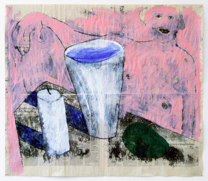
GLL: Yes, I love that "slip it to me" moment! Because of how you incorporate the newspaper, you are able to appropriate the language and visuals of pop culture and current issues in a way that feels, as you put it, "serendipitous" and not forced. It's also humorous at times. Can you talk about Donald Trump and this series? I see him in Slip It to Me as he appears in the paper, arm lifted in a “Heil Hilter” stance.
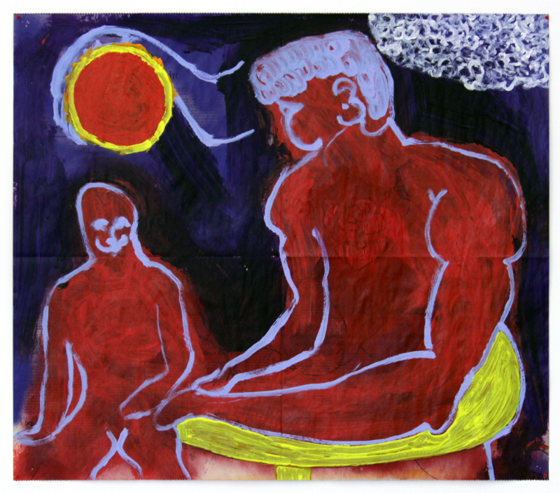
CR: Ya, the newspaper is a great way to add pop culture/current events into the mix. It's whimsical and a little scary at times. And Trump, he's everywhere! He's popped up many times in the paintings—often getting painted out because he drives me crazy. In Slip It to Me he lays on the table like an object, maybe like a little statue. He's like some of the objects in the paintings with table "offerings" that I don't like, like the avocado in Pink Man with Avocado Offering. The objects were kinda metaphors of things someone could offer you physically and spiritually, some of them desirable and some not so desirable.
GLL: Yes, about the “offerings,” I'm really interested in how you use objects—flowers, fruit, vessels—as symbols. Do they all hold specific meaning? If so, do you borrow their significance from art history?
CR: The objects and flowers can be read as part of a long history of this sort of imagery in painting. Specifically, I think of Dutch still life painting. In those paintings—I'm specifically thinking of Wybrand Hendriks's Flower Still Life in the Portland Art Museum's collection—every flower has a meaning, every fabric, all the way down to the one dirty fly perched on one of the flowers. It's so voluptuous and sensual, but then there's a dirty fly there to fuck up your hot moment with this painting. And perhaps the realist part of the painting is the nasty fly just hanging out. I love it! So gross! In my work, I'm not THAT invested in a universal meaning, but rather a mix of gestural meaning and symbolism. The meaning is more personal than universal. Like how a cup of water means life, flowers mean sex or body is more universal, whereas the avocado is more personal. I hate avocados.
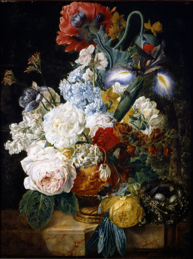
Wybrand Hendriks, Flower Still Life, 1810/1830, oil on panel, Portland Art Museum Collection
GLL: How about your figures? They appear like symbols in how they are almost "unspecific" or anonymous. Do you feel that way about them, or are they more individual than that for you?
CR: Most of the time the figures are someone specific, but as they get worked over, printed painted and drawn, they become more like a composite of men. You can see that many of the marks from the painting of "Kyle" are borrowed from the earlier drawing. The initial small drawing/collage was based off of a photo someone sent me. I then merged part of the drawing with the painting using a silkscreen method because I thought the long torso was similar to Kyle's body type. But like in Avocado Offering, the figure is obscured to the point that he reads more like a universal man. And like in life, some guys are more memorable than others, or the idea of them is better than the details.
GLL: Can you talk about how you think about and approach perspective? I'm specifically thinking of the wonderfully skewed perspective in Avocado Offering.
Untitled (Pink Man with Avocado Offering), 2016, monotype and acrylic on newsprint, 22.5 x 26"
CR: Perspective is something I've been thinking about a lot. Your questions about the table is a consequence of how I build images. I still utilize collage. Sometimes in paper form as well as digital. The collages sometimes create funky perspectives and sometimes when I work digitally the bodies become more elongated and awkward. In both situations, I think it's more about depicting the psychology of space or someone. It's meant to come across as awkward or "not right." Both the forms and color are meant to have more visceral effects than contain literal information.
When people ask me about "perspective," they are often concerned with how I position myself to my subjects. I often make work in 2nd or 3rd person. It's often the perspective of an artist looking at their subjects or the perspective of a camera man. IDK how I would ever paint myself in 1st person. That might be getting too personal. Lol.
GLL: Haha, maybe it’s something to experiment with! My last question is about NYC. I also left Portland to study in New York, and found that the city had a profound impact on how I view and think about art. How has the city shaped and influenced your work and painting practice? What are your favorite and least favorite things about NY?
CR: Moving to NY was a VERY humbling experience. Obviously Portland and NY are VERY different. In some ways better and some ways worse. But as far as my work goes, moving to NYC and doing grad school at Hunter was a great way to shake up what I was making in Portland. I feel like after a few semesters, I've learned to become more critical of my own work and I started to question my own motives and process. Before NY, I think my work was very linear and there was a clear start with a clear finish when making it. Now, I find myself reworking ideas over and over until I get sick of them.
This might sound strange, but I feel like I'm living more. It's nuts here. I am always on the go, seeing things, meeting people, working. This pressure-cooker type environment has done a lot for me in terms of production and energy. It has also caused me to go prematurely grey! But all of it is worth it. The opportunities are endless and so are the boys ;-)
And as far as school goes, I've been very blessed to work with artists like Carrie Moyer, Drew Beattie and AK Burns. They have done a lot in terms of shaping how I look and approach making work. I think the grad school setting has made me a lot more skeptical of art. I tend to not only question what it is I do and why, but also every other artist making work. As art becomes more commodified, I feel it's necessary to question all and everything being made and consumed, especially in NYC.
My least favorite things about NY are: rats, weekend train rides to Brooklyn and litter! Yuck! That's one thing Portland does not put up with! But my favorite things about NYC...
1) The food here is amazing.
2) The history that is all around you when you live in a city that is a couple hundred years old. Time is a very humbling thing to think about.
3) The amount of amazing museums and quality shows that are open to the public. I see amazing art every week and it's great what that energy does for your mental health. And lastly,
4) The access to artists. You can reach out to almost anyone here and they'll respond, big or small. For a city that can feel so lonely at times, there is also a great sense of community if you know what you're looking for.

Untitled III, 2016, xerox and ink on paper, 9 x 12"