Emily Counts and Gabi Lewton-Leopold catch up to talk about Emily’s new body of work now on view at Nationale in her solo exhibition, Souvenir.
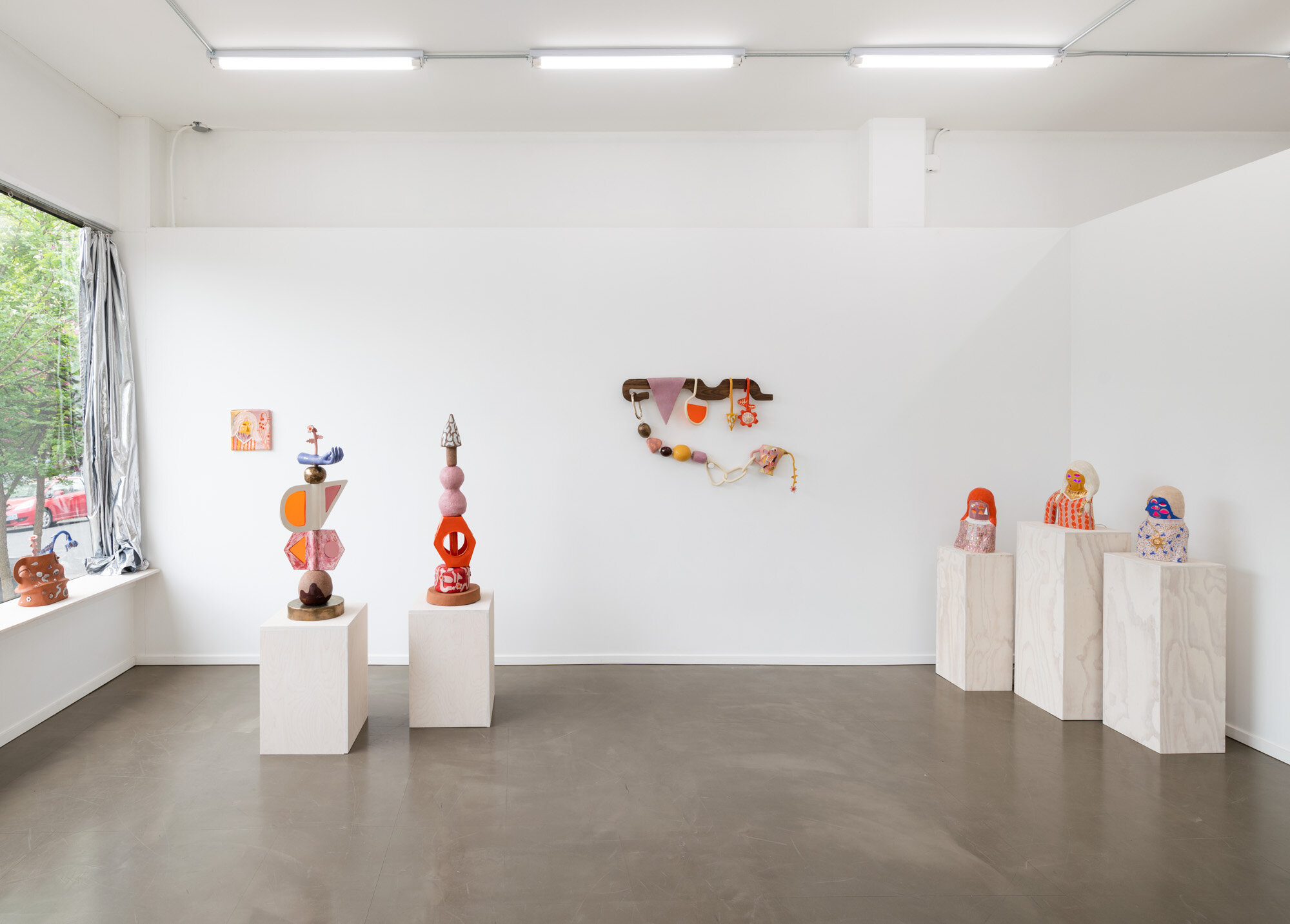
Emily Counts’ Souvenir, on view at Nationale through June 6, 2021.
All images ©️ Mario Gallucci
Gabi Lewton-Leopold: How has this past year been for you and your studio practice?
Emily Counts: I’ve had two bodies of work during the pandemic. I think there’s been a little bit of a shift between the first one, and this new body of work. I initially pared down my materials to just ceramics and glazes, or materials I already had in my studio, because it felt stressful to go out and source wood and other components that I used to often incorporate. With this body of work, I started to go back again to go to the places where I get non-ceramic materials. For instance to buy stained glass, you do have to be kind of physical, and go through shelves or bins of glass. Look at them, touch them, hold them. Things that other people may have touched. I wasn’t doing that type of thing in the beginning of the pandemic, was very isolated and really just using what I had. Thankfully I had stocked up on clay and glaze prior to that.
GLL: At the beginning of the pandemic lots of artists were talking about feeling frozen, like they couldn’t create. Was that true for you or were you able to work through it?
EC: No, I think my natural reaction to what feels like an extreme crisis is to initially be somewhat freer in the studio. There have been certain times in my life when I’ve had a crisis, like when a loved one has passed away, and for maybe a period of four months I feel like I have nothing to lose, and so I really go for it. I wanted to embrace life, as a reaction to thinking about death, in regards to what I was doing with my art. I think most artists I know were experiencing troubles creatively at the beginning. That came for me a little later.
It took me a lot longer to create this show than it might have in the past. I felt myself moving at a slower pace. I put a lot of care into these pieces. Slowing down and having a longer time frame with these works, I feel like everything has been really cared for. I put a lot of emotion into these pieces. They all really matter to me.
GLL: Can you talk about your interest in exploring childhood memories in your work?
EC: I have always been interested in exploring early memories, but I don’t think I was necessarily comfortable talking about childhood themes to this extent. I think my most powerful visual experiences come from childhood experiences. Certain objects like children’s books, games, play structures, have influenced who I’ve become as an artist and as a human. Those are really powerful experiences and I have always been tapping into those memories, but with this body of work I was more aware of the specifics, and the particular things from my past. Every surface, every color I have associations with, there’s a reason behind everything, every shape.
I wonder if other people have the same type of experiences from their childhood. Some people are maybe more influenced by food or music, sounds, or physical experiences. When I think about what my dreams look like, they’re very material focused. It ties into how I’m a sculptor, and how I am interested in things that are tactile. The visual and tactile quality of objects. I’ve always been really fascinated with things that you see and touch.

It’s For You, 2021, glazed stoneware and porcelain, white gold luster, acrylic sheet, copper wire, 17.5 x 15 x 4 inches
GLL: The three female busts in the show have so much character. Who are they and how did they come to be?

Orange Witch, Woman With Sweater, and Grandmothers Powers
EC: I’ve been working with abstracted human head and bust-type forms for many years now. This is an evolution of those thoughts, of how I can represent myself or another human. These three are very specifically female. The pandemic has made me think more about the people in my life that I love and miss. Sort of contemplating my relationships. My mother and my grandmother, and my great-grandmother are/were all creative people, and I feel like my interest in art came to me through those women.
These busts aren’t representing just those women specifically. I was also thinking about three women I did a residency with in February of 2020. It was just the four of us living on a houseboat in California. It was a wonderful, utopian moment with these other three women artists. It was called the Varda Artist Residency Program, on a decommissioned ferry boat, a place where artists have been working and living in various forms for decades.
For these busts, I was thinking of my relationships with women, friend groups of women or other women family members, and their relationships with each other. Also a little bit about magic and witches and covens. I think these busts are about magic.
GLL: You always have a wonderful way of combining natural, traditional sculpture materials like ceramic and wood with unexpected elements like electricity and acrylic sheets. When did you start incorporating electricity into your sculptures?
EC: I started incorporating electricity and illumination in my sculptures in 2010. That is the first time I experimented with stained glass and bringing that into a ceramic piece with a hollow interior, illuminating the piece from the inside. With the incorporation of light I’m really interested in the different experiences of feeling or seeing color. I like to pair illuminated or glowing color, by using stained glass, acrylic sheets, or colored lights, with the opaque colors of ceramic glazes and other non-transparent materials. The colors that you get from stained glass are a different range than what are available in glazes.
I am experimenting with brighter and warmer colors like marigold, vermillion, lavender, mauve, red, and also using that bright royal blue that I have used in the past. I’m experimenting and trying to find out what I like right now.

Grandmothers Powers, 2021, glazed stoneware with gold luster, electrical components and lighting, 15 x 7.5 x 7.5 inches
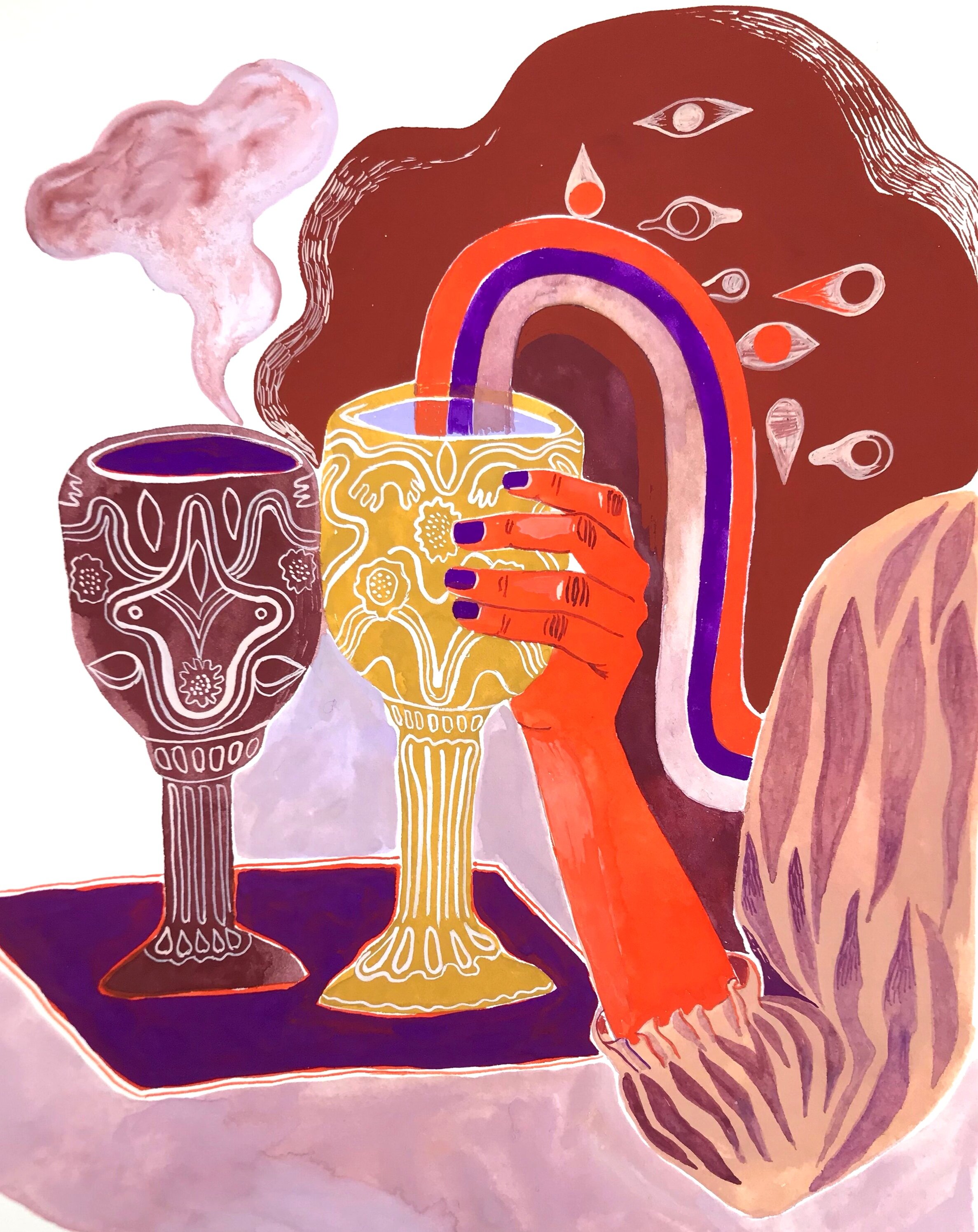
GLL: The linked vessels are so poetic and subtle. I read them as forever linked, and that has a sweetness to it, but there’s a flipside to that. They're forever linked, so therefore they can never perform their “intended” function. Sometimes you can be linked with a person, or with anything in your life and it can feel like something pulling you this way and that, and not letting you do what you need to do.
EC: You mean feeling trapped?
GLL: Yes, feeling trapped, basically! Am I reading too far into it?

Two Futures, 2021, glazed stoneware with gold luster, 12 x 7 x 5 inches
EC: It’s interesting because other people have asked me about that, specifically about the functionality being removed. First, the idea for the linked vessels did come out of the beginning of the pandemic and thinking about missing people, and noticing the people on the street holding hands, and knowing that is significant. I was thinking about the importance of touch and just wishing we could all hug the people we love. But we can't. The idea also came to me at the time I got engaged. I had thoughts about partnership and intimacy, friendship and family, and all the ways that people are connected. It’s a symbolic connection and I’ve represented that symbolic connection with these linked handles. Just in the way that we’re connected to someone who died even when they’re gone physically.
I have been using vase, vessel, and pitcher forms as abstracted surrogates for the human body or beings, and so I think of these vessels as art pieces and their functionality is to bring beauty, rather than to dispense liquids. For me the functionality is there, in their beauty. That’s my own relationship to the idea of a vessel at this point since I’ve been working with them for a number of years, and I don’t think of them of being deprived of function when linked by the handles. I’ll think about that trapped feeling...
GLL: Well, like with any piece of art, my reading is also a reflection of what’s going on in my own head. Like I’m feeling trapped as a parent or something…
EC: It’s interesting because I’m a fairly independent person. I don’t want to be joined at the hip and do everything with my partner. If the vessels represent a romantic relationship ideally they would be linked but left open at the bottom. But it’s also sculpturally a challenge. It’s really tricky to glaze them when they’re joined, so that’s technically interesting to me.
GLL: I’m thinking about a few of the wall pieces and stacked sculptures that are compiled of separate elements. With those pieces, do you have the whole piece in mind while you’re working, or is your studio filled with individual elements that eventually find their place in a larger work?

It Means What You Feel, 2020, glazed stoneware with gold luster, walnut wood, stained glass, cotton rope, copper, hardware, 29 x 49 x 4.5 inches
EC: I sketch them out, either through quick drawings or small paintings on paper. I need a roadmap or a diagram to work from. It takes a lot of the stress out of the process for me. Almost everything I make comes from a two-dimensional idea. I am starting to use color more in this process but previously I worked from simple black and white drawings and would figure out the colors when glazing on ceramic surfaces. Colors are the in-the-moment creativity part that’s more difficult.

GLL: Do you have a favorite piece in the show?
EC: I really like the bust that has the yellow face, the white hair, and the lavender and orange sweater. I can’t put my finger on it. I think I’m happy with the way the colors turned out in that piece. Those are the colors that are my go-to palette right now. There are little details about it that I’m pleased with.
I’m always searching for what I think is beautiful to me at any given moment in time, as it shifts. That’s really hard, to be successful for my own personal standards. It’s difficult to land on something that I think is beautiful for more than a few months.

Woman With Sweater, 2021, glazed stoneware with gold luster, electrical components and lighting, 15 x 11 x 6.5 inches
GLL: What are you looking forward to in your practice right now?
EC: I have a new interactive ceramic sound piece that uses little sensors that are light sensitive. It’s a white noise machine and people can interact with it, changing the noise quality, just with the motion of their hands above the sensors. The electrical components on the inside of this piece are from a kit called an “Optical Theremin.” I’m excited about getting back into pieces that use sound and interactivity, but trying to work with interactive elements that don’t necessarily require touch. I stepped away from that for a while because of virus concerns. I’d like to do more projects like that in the future.
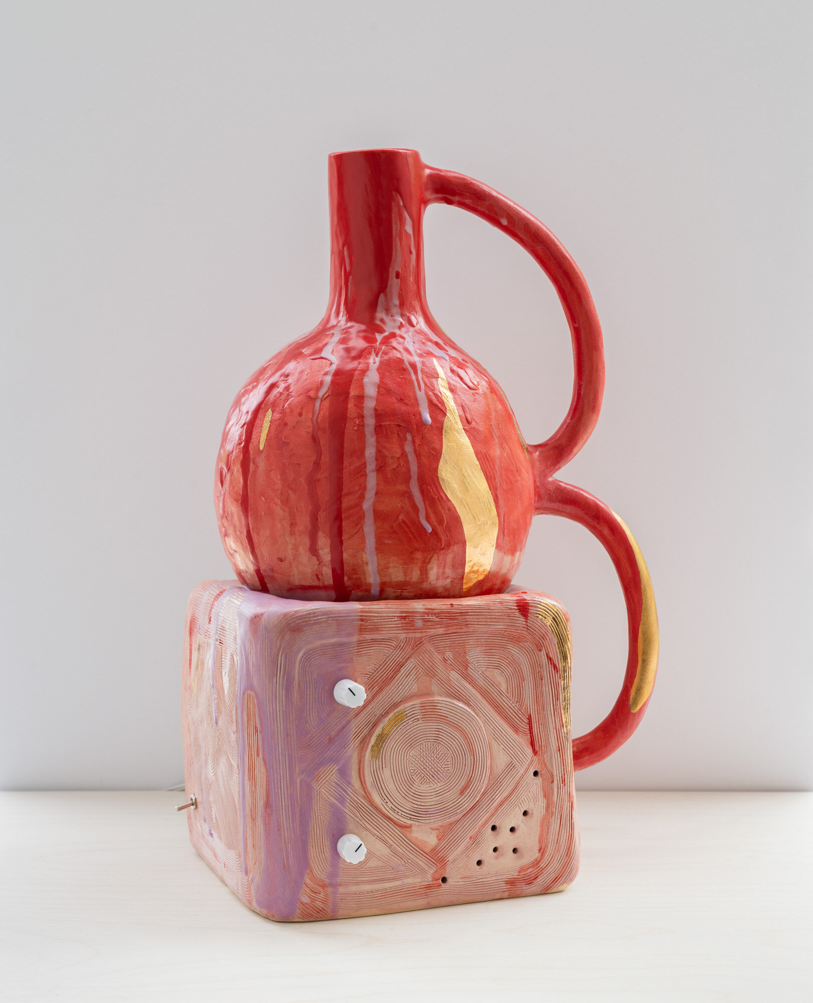
Red Noise Bottle, 2021, glazed stoneware with gold luster, circuitry, optical sensors, amplifier, electrical components, hardware, 15 x 10 x 7 inches
Thank you to both Gabi and Emily for this lovely conversation. We’ve missed this interview series so much!