"RELAXO PATIO" THIS SUNDAY (1—4PM)

Phone Porn, 2015, oil on air dry clay, 7 x 4.5"

Phone Porn, 2015, oil on air dry clay, 7 x 4.5"

Please join us this Sunday, January 10 (1—4pm) for the reception of Relaxo Patio, Lindsay Kennedy's third solo exhibition at Nationale. Inspired by the lush life of Miami Beach, Relaxo Patio with its pastels abstractions and luxurious floral textures, is a welcome visual respite from the icy, grey days of winter. The exhibit showcases Kennedy's diverse yet fully realized style, as it fluctuates between the grid-like "knit" paintings composed of hundreds of dabs of paint, alongside paintings of looser, textured brushstrokes. 


THIS SUNDAY AT THE ART GYM: and from this distance one might never imagine that it is alive

Pat Boas, Three Triangles and Three Colors, Sumi ink on paper, 2015, Courtesy of Elizabeth Leach Gallery

Pat Boas, Three Triangles and Three Colors, Sumi ink on paper, 2015, Courtesy of Elizabeth Leach Gallery

Join us for the opening reception of and from this distance one might never imagine that it is alive at The Art Gym this Sunday, January 10 from 4-6pm. Represented artist Amy Bernstein has work in the show alongside a number of amazing artists. Amy will also be giving an artist talk with fellow-painter, Michelle Ross on February 24 at 11:30am. Press release below. 

and from this distance one might never imagine that it is alive // January 12 - March 5, 2016

Opening Reception - Sunday, January 10, 4-6pm
Conversations on Painting -
Amy Bernstein and Michelle Ross - Wednesday, February 24, 11:30am
Pat Boas, Calvin Ross Carl, and Michael Lazarus- Tuesday, January 26, 3:30pm
Jack Featherly and Grant Hottle- Friday, February 12, 10:30am  
Roomful of Teeth event in partnership with the Music Department - January 29, 7:30pm

The Art Gym at Marylhurst University will present and from this distance one might never imagine that it is alive from January 12 to March 5, 2016.  This group exhibition will feature ten artists of the Pacific Northwest working with abstraction in painting.  The artists included in the exhibition work in a broad range of formal and conceptual abstraction, and within a broad definition of painting.

and from this distance one might never imagine that it is alive, curated by Blake Shell, includes works by Amy Bernstein, Pat Boas, Calvin Ross Carl, Jack Featherly, Ron Graff, Robert Hardgrave, Grant Hottle, Michael Lazarus, Michelle Ross, and Amanda Wojick.

An opening reception will be held from 4-6 pm on January 10, 2016.  The Art Gym will publish an accompanying catalogue, designed by Sibley House, that includes an introduction by Blake Shell and essays by art writers Graham W. Bell and Sue Taylor.

The Art Gym is supported by the Robert and Mercedes Eichholz Foundation, the Collins Foundation, the Oregon Arts Commission, and the National Endowment for the Arts. The Art Gym’s publication fund is supported by the Harold & Arlene Schnitzer CARE Foundation and Linda Hutchins and John Montague. 

This exhibition and publication are made possible in great part through the generosity of The Ford Family Foundation.  Other individuals and businesses provided additional support.


INTERVIEW: JD BANKE

We recently caught up with Seattle-based artist, JD Banke about his current show at Nationale, THE MEANING OF LIFE IS LIVING

Gabi Lewton-Leopold: THE MEANING OF LIFE IS LIVING, the title of your current show at Nationale, is a bold and seemingly simple affirmation that can be so difficult to heed in our daily lives. Can you talk a bit about what it means to you in relation to the work on view?

JD Banke: It's a play on words in regards to one of the still lifes in the show and the tradition of vanitas painting. I was imagining some Dutch master in some long ago time laboring for years on a masterpiece painting of fruit and a skull, and I thought it was funny that somebody would spend so much of their life making a painting about death. I try not to take art making so seriously and I thought the title should mirror the attitude of the paintings.

Feast for the Eyes #1, 2015, acrylic on wood, 22 x 14”

Feast for the Eyes #1, 2015, acrylic on wood, 22 x 14”

GLL: Your paintings remind us of how prevalent symbols are in our world, and how easily a simple sign can create a specific meaning. There are overt ones in your work like: logos, four leaf clover, playing cards, magic eight ball, and so forth. The symbols you use are often times also cliches or characters: Bart Simpson, Santa Claus, an abstract painting, or a human skull. There’s humor within your work partially because you use these familiar signs and mixing of “high” and “low” cultural references. Can you tell us about your interest in signs and symbols and how you view them within your work?

Feast for the Eyes #2, 2013, acrylic on wood, 38 x 48”

Feast for the Eyes #2, 2013, acrylic on wood, 38 x 48”

JDB: I'm interested in visual trends and what is cool on the Internet. I used to find joy in being a person who was using unique symbols; I found a small sense of individuality or something I could say was uniquely me. Then I came across work online that was doing similar things, and I lost that sense. I was oddly upset for awhile. I find myself thinking about originality and how it’s perceived and decided that I don't want to be original. I want to use cliche symbols and tropes to express my thoughts. 

If I like a symbol visually, and can use its meaning in an odd way, I'll use it. I like the idea of having a weird visual alphabet to create with. Recently, I started including my own work into the symbol catalogue. In the Romeo and Juliet diptych they both have the word "yeah" painted on them with the colors inverted. Yeah was a painting I made in 2012, and it seemed appropriate for Romeo and Juliet to be saying that, so it’s in there. 

Romeo, 2015, acrylic on wood, 16.75 x 14” & Juliet, 2015, acrylic on wood, 16.75 x 14” (right)

Romeo, 2015, acrylic on wood, 16.75 x 14” & Juliet, 2015, acrylic on wood, 16.75 x 14” (right)

GLL: Speaking of text, I'm interested in your practice of painting text and then redacting the words, so only fragments or the shadow of what was there remains. What does this act of erasure mean to you?

JDB: For me redacting the text can mean one of two things, or both: compositionally, if the text wasn't working and needed some blocking out of the letters to look right, I'll cross stuff out and write it again. Or, I most likely spelled something wrong and Googled the word then wrote it in correctly. 

I started having ideas about writing and so I started writing down those words, and that eventually turned into poetry. I like that slow cumulative process. If I don't feel like painting, it's nice to have another medium to play with. Sometimes the writing and painting overlap and it just clicks.

GLL: Although this work is clearly influenced by the still life tradition, they also have a very object-like presence, partly because they are panels that protrude five inches from the wall, and also due to your thick application of paint. This is in contrast to the traditional still life or vanitas painting which was intended to be a “window onto the world” rather than an object itself. Is there a conscious intent to subvert boundaries between mediums by creating "sculptural" paintings?

JDB: Yes, the thickness of the panel is intended to be a subversion and blur the line between painting and sculpture. I construct my own panels, and this gives the freedom to play with space the same way a sculptor or installation artist would, but it's still painting. It's fun. This show at Nationale is the first one where none of the paintings have been on the floor.

Sure, 2015, acrylic on wood, 12 x 8” & Untitled, 2015, acrylic on wood, 19.5 x 14”

Sure, 2015, acrylic on wood, 12 x 8” & Untitled, 2015, acrylic on wood, 19.5 x 14”

GLL: You mentioned in the past that your paintings are partly about the obligation you have to being a part of the (art) world that you’ve chosen to participate in. Can you tell us more about what you mean by “obligation” and how it informs your practice?  

JDB: I feel more obligated to be aware of the art world rather than to be an active participant in it. I make references to it often, and without my awareness of it my work doesn't have as much of a context. But I like the idea of making fun of the art world because so much of it feels like a dog and pony show soap opera, which I kind of love. I see it as this weird fantasy world that I could be a part of some day if I make good paintings.

GLL: Nationale currently has your painting, Dog  Stroller in the backroom gallery from your series “Chairman of the Bored.” The series features a hooded, slightly mysterious character in a camo jacket shown in various public settings: park, shopping mall, museum, and so forth. As with all of your work, it seems to represent a revolt against our homogeneous, capitalist world. Who is this character you’ve created and what is he here to tell us?

Dog Stroller, 2015, acrylic on wood, 15 x 12"

Dog Stroller, 2015, acrylic on wood, 15 x 12"

JDB: The camo guy is this weird manifestation of myself. He does things that I have done, will do or have dreamed of doing. He's trying to tell people to get a grip and chill way out. 

JD Banke: THE MEANING OF LIFE IS LIVING on view at Nationale through December 31, 2015

JD Banke: THE MEANING OF LIFE IS LIVING on view at Nationale through December 31, 2015

CONFESSIONS / JESSICA JACKSON HUTCHINS (now in stock)

Confessions was commissioned as part of Jessica's two-space exhibition of the same name at the lumber room and the Douglas F. Cooley Memorial Art Gallery, Reed College. It was made like a sculpture, layer by layer, over the months proceeding and during the exhibition. It is partially a documentary of the creation of these two shows, as well as a documentary of its own creation. It is a sheaf of hoarded collage materials. It is a zine, metastasized. It is the stuff in the room.

Designed by Jessica Jackson Hutchins, Gary Robbins, and Heather Watkins, Confessions was printed and bound at Container Corps.

216 pages / 144 x 206 mm / Edition of 450 / Printed offset in full color with various spot colors throughout, smyth sewn softbound in cloth / $ 45

CONGRATULATIONS EMILY, TY, AND ELIZABETH!

Congratulations to represented artists Emily Counts, Ty Ennis, and Elizabeth Malaska on their Project Grant awards for 2016 from RACC. This funding will make a significant difference for these full time working artists and/or young parents preparing for solo exhibitions this coming year.

Emily Counts / Solo Exhibition / Artistic Focus / Visual Arts ($3,609)
I am seeking funding to create a body of work for a solo exhibition at Carl & Sloan Contemporary in mid March through April 2016. This exhibition will consist of small and large-scale abstract sculptures in a variety of media including wood, concrete and bronze, with an emphasis on ceramics. The works will explore themes of connectivity and fluidity in biology, technology and culture. With these new sculptures I will expand my ongoing experimentation with sequenced, stacked and connected objects. My goal is to create for the viewer an environment that suggests a narrative format, within each sculpture and throughout the gallery space, without the use of representational forms. Wall mounted pieces in various sizes will surround a large central freestanding sculpture. It will be my tallest and most complex sculpture I have created to date, comprised of stacked individual objects that decrease dramatically in size as they rise in a 7-foot column. I believe this piece especially is necessary for my creative development and that it will be a powerful focal point for the entire exhibition.

Ty Ennis / Solo Exhibition / Artistic Focus / Visual Arts ($ 3,855)
For my March 2016 exhibition at Nationale, a gallery, shop, and performance space on Southeast Division Street in Portland, I will be working on my first solo show since becoming a father in 2013. The project currently consists of small black & white paintings on canvas that explore my present day-to-day life as an artist and young father with a full-time day job. Like most of my past work, they tell individual stories that are all part of a larger personal and reflective narrative. The final body of work presented will consist of 12 professionally framed acrylic paintings. The framing is key to my conceptual vision for the exhibition, as each frame will be sprayed a different color to match a certain detail in each painting. I will also produce a catalog in conjunction with the show that will include personal writings, reproductions of the work, and an essay by a commissioned writer. There will be a public reception at the gallery, an artist talk and conversation with the Assistant Director, and a private tour of the exhibition with a Q&A for students of PNCA (my alma mater).

Elizabeth Malaska / When We Dead Awaken II / Artistic Focus / Visual Arts ($ 4,612)
When We Dead Awaken II is an exhibition of paintings by myself, Elizabeth Malaska, to debut at Nationale in September of 2016. Nationale is a gallery, shop, and performance space located in southeast Portland. The show will consist of eight paintings on canvas: three large scale, two medium scale, three small scale.
The main themes of this body of work are a reexamination of the nude female body in the history of painting and a critique of the current global culture of patriarchal aggression. These issues are addressed in the work through subject matter, specific use of materials, and strategic employment of technique. I began this body of work in the winter of 2013. The first installment of seven paintings was presented at Nationale in November, 2014. In Winter, 2017 I will show the entire series (parts I and II) at PCC Sylvania Campus’ North View Gallery. The upcoming Nationale show will include a public reception. I will also host a gallery talk open to the community, and two lectures with student groups from OCAC and PNCA. All talks will take place in situ at Nationale.

OUR FAVORITE GIFT IDEAS...

Old Tiger necklaces with OLO fragrance

Old Tiger necklaces with OLO fragrance

Kate Towers mega totes// Modern Women totes from LA based Sarah Gottesdiener

Kate Towers mega totes// Modern Women totes from LA based Sarah Gottesdiener

"REQUIRED READING": Men Explain Things to Me, Rebecca Solnit // Between the World and Me, Ta-Nehisi Coates // Citizen, Claudia Rankine

"REQUIRED READING": Men Explain Things to Me, Rebecca Solnit // Between the World and Me, Ta-Nehisi Coates // Citizen, Claudia Rankine

Sword & Fern shadow hoops...

Sword & Fern shadow hoops...

Henri Matisse and Frida Kahlo coloring books!

Henri Matisse and Frida Kahlo coloring books!

Myranda Gillies rings

Myranda Gillies rings

Chestnut creme (jar and tube) and 5 year diary

Chestnut creme (jar and tube) and 5 year diary

St Eloy one of a kind hand-painted necklaces (image courtesy of St Eloy)

St Eloy one of a kind hand-painted necklaces (image courtesy of St Eloy)

RECEPTION THIS SUNDAY FOR SEATTLE'S JD BANKE

unnamed.png

So excited to offer Seattle's JD Banke his first Portland exhibition. Join us this Sunday afternoon (3–5pm) for the reception. It can be daunting to show in a new city without the support of one's community, so I hope you will help me in welcoming JD and showing him a good time.

LAST DAYS TO BID ON A CARSON ELLIS ORIGINAL

A rare opportunity to collect a Carson Ellis' original. Read more about Carson's donation to Mercy Corps below and place your bids until Monday morning on Ebay.

Hi friends,

A couple of weeks ago I made an illustration for this piece in the New York Times by Arthur C. Brooks about gratitude. It was in the paper the Sunday before last. Since then a lot of people have asked to buy a print of it and a few people have inquired about buying the original painting.

I'm very grateful this holiday season. For one, I feel profoundly lucky to be able to make a living as an artist. It's not a thing I ever expected to be able to swing and I don't take it lightly. So thanks very much to those of you interested in what I'm up to creatively. But even more acute is my gratitude for the health and happiness of my family. I think about this a lot. I try my best not to take it for granted. Which is why my heart aches so much for those who don't have what we have: food, shelter, safety.

Anyway, I am planning to make some prints of this painting. I'm pretty sure they'll be available in time for the holidays. Stay tuned. But! I'm also going to auction off the original painting and donate 100% of the proceeds to Mercy Corps, an organization that works to help people in need and to save lives every day. So, if you love this painting or if you want to help or ideally BOTH, you can bid on it HERE.

3|3|3: TODD JOHNSON | ELIZABETH MALASKA | STEPHEN SLAPPE

Image: Detail of a debut installation by Stephen Slappe, 2015. OUR PEACE is a 4-channel immersive video environment created from documentary footage captured in Portland, Oregon.

Image: Detail of a debut installation by Stephen Slappe, 2015. OUR PEACE is a 4-channel immersive video environment created from documentary footage captured in Portland, Oregon.

Nationale is pleased to announce that represented artist Elizabeth Malaska is included in 3|3|3, an exhibition curated by Cris Moss at White Box. Please join us this First Thursday, December 3, for the reception.

3|3|3
Todd Johnson | Elizabeth Malaska | Stephen Slappe
December 1 – December 19, 2015
First Thursday Opening Reception, 6:00p.m. – 8:00p.m.

White Box  is pleased to present 3|3|3. This exhibition features painting, video, and photography by Todd Johnson, Elizabeth Malaska, and Stephen Slappe. Each artists’ work occupies one of the three galleries in the White Box. The exhibition runs for three weeks.

Todd Johnson is an experimental and conceptual photographer living and working in Portland, Oregon. His photographic work uses abstract metaphor, social critique, dark humor and personal narrative. Johnson received his MFA in photography from the San Francisco Art Institute. Todd is the founder and director of Black Box Gallery. Recent solo exhibitions include: The Misadventures of Ansel Adams: Garage Sales, Geotracking and General Tomfoolery at The Art Gym at Marylhurst University; Dangerous Territory at Pacific Northwest College of Art; and Malt Liquor and Cold Cuts at False Front Gallery.

Elizabeth Malaska’s paintings, with their dramatic juxtaposition of subject, material, and technique dispel normative readings, while also warning against the impending apocalypse of global complacency. Coupled with the artificiality of her statuesque female figures and geometric settings, they transition from everyday narratives into urgent allegories. Malaska earned her MFA from the Pacific Northwest College of Art. Her work has been exhibited nationally at various institutions including Portland’s Nationale, Froelick Gallery, Disjecta, Portland Center Stage, and San Francisco’s California College of the Arts, where she also received her BFA. She was named a finalist for The Joan Mitchell Foundation MFA Grant and the Fine Arts Work Center fellowship in Provincetown, Massachusetts. Malaska is a recent recipient of the Barbara Deming Memorial Fund’s Money for Women Grant. Malaska lives and works in Portland, Oregon, where she is represented by Nationale.

Stephen Slappe, an artist based in Portland, Oregon. Utilizing video and subversive installations, Slappe creates work that critiques technology and society’s inherent reliance on it. Viewers become immersed in environments where the parallel lines of reality and perceived social media become blurred. Slappe’s work has exhibited and screened internationally in venues such as Centre Pompidou-Metz, Portland Institute for Contemporary Art’s TBA Festival, The Horse Hospital (London), The Sarai Media Lab (New Delhi), Consolidated Works (Seattle), Centre for Contemporary Art (Glasgow), and Artists Television Access (San Francisco). His projects have been funded by multiple grants from the Regional Arts and Culture Council of Portland and an Individual Artist Fellowship from the Oregon Arts Commission. Slappe actively organizes video and film exhibitions including Subduction Zone at The Front (New Orleans) and Out of the Great Northwest at The Horse Hospital (London). His most recent project is an iOS app, titled 8, available on iTunes.

SELF PUBLISH / BE HAPPY

We were happy to see the new DIY photobook manual from Self Publish, Be Happy featured in the Guardian this weekend. Represented artist Delaney Allen's first publication, Between Here and There, has a few pages included. Congrats, Delaney!

Stop by and pick up copies of both Self Publish, Be Happy and Between Here and There during your next visit to Nationale.


BACKROOM MINI "REMODEL"

Happy Monday from the backroom!

Happy Monday from the backroom!

A big thank you to Katie Behel for gifting us a large pedestal/storage box. It was a great excuse to move pieces around on the walls and reveal yet another version of the backroom gallery. More information about older pieces can be found on our "COLLECTING" page.


INTERVIEW: AMY BERNSTEIN & PATRICK KELLY

Amy Bernstein and Patrick Kelly reflect on their work and current exhibition, The Liminalists, now on view at Nationale through December 4.

Amy Bernstein & Patrick Kelly at the Disjecta Art Auction in front of Jeffrey Kriksciun's textile // photo by Katie Bernstein

Amy Bernstein & Patrick Kelly at the Disjecta Art Auction in front of Jeffrey Kriksciun's textile // photo by Katie Bernstein

Gabi Lewton-Leopold: I wanted to first get a little background on how you two know each other if you had ever thought of combining your work in this way?

Patrick Kelly: We met working at Stumptown, but we never really worked together here in Portland. I remember hearing that Amy was an artist, and I don’t even know if I had seen any of your work. I feel like I had, but I just remember various times we’d meet up at other events and have small conversations. I remember that when I started making these kind of works, Amy was one of the people I tracked down to see them, she and a couple of other people. I saw these particular individuals almost as points of validation: like, if these people approve, then I’ll keep pushing this. I don’t know if I really ever thought before about putting our work together.

Amy Bernstein: I don’t think we ever thought about working together, but the coolest result of this exhibit has been all of our conversations about how and why our work does work together. Just getting to work with Patrick has been such an honor for me; we’ve been colleagues and friends for such a long time. Most of our conversations before were sort of casual shoptalk, just shooting the shit, you know “what’ve you got going on? What are you thinking about?” Pretty classic stuff but not exactly “let’s collaborate” or “let’s see what from having our works exist in the same space.”

GLL: You did studio visits?

PK: Yeah, leading up to the show. It was funny; she and I had been sort of working respectively, for quite a while, developing these bodies of work. In a way these conversations we were having, it felt like they should have already happened, or had been waiting to happen for a long time, and this show finally realized them. Sometimes it feels like you need something to bring those conversations to light.

Amy Bernstein & Patrick Kelly: The Liminalists at Nationale

Amy Bernstein & Patrick Kelly: The Liminalists at Nationale

GLL: That leads to another question: you both have these distinct bodies of work, how did they develop?

PK: Many years ago when I started working on these drawings, the initial starting point was a point of frustration, of trying to build and design these horrible sculptures that just didn’t work. I was trying to force and mash these disparate materials together.

GLL: What were they made out of?

PK: A lot of it was black plastic, rope, and earth. It was that of creating a movement or traction of earth, of earth being pushed around. It was a horrible process. When I tried to redesign them, I started drawing them with pencil to plan out what was going to happen. Then I realized I was getting a lot more of a response, actually physically drawing these ideas—capturing movement with a pencil.

GLL: And when did you start using the template, or what do you call it?

PK: It’s been called a template, a jig, a guide, so many different things, which is really funny. I’ve never really given it a name. It’s not necessarily a very precious thing, so I never really thought of it as having a name. They are shapes that have been designed from quick gestural sketches and then cut out from foam core. The contour of the shapes are then traced repeatedly with pencil as I shift and rotate it minutely across a page.

GLL: But each piece uses a different one?

PK: Oh yea, definitely, and there are multiple ones in each piece.

AB: I think that the similarities of the way in which our work developed, which is maybe always the way it is when you are making work for a long time, is coming to a point when you realize that the process itself is problematic. I used to work on pieces for such long periods of time that they would become buried under other pieces. The work couldn’t be what it wanted to be. I think about language a lot, and writing, and the language of painting. I think about the visual language and trying to make your own. Making a language can take a very long time. It isn’t this way for everyone. But for me, I was putting it all in the same place rather than letting the words, or the symbols stand by themselves, so all this white space started to creep in so that these kind of quantifiers could have a space to exist. They needed it, and they responded to it, and then they could talk to each other in this space, so that’s how these kind of works developed. I think that oil paint can do anything, it’s such an amazing recorder of time, or of a moment. And for the surface to be incredibly smooth, it becomes an even better recorder.

Amy Bernstein, Vowel Sounds, 2015, oil on canvas, 28 x 26”

Amy Bernstein, Vowel Sounds, 2015, oil on canvas, 28 x 26”

GLL: You both talk about time, and there is something very time based about both bodies of work. There’s a feeling of accumulation and process but in different ways.

PK: Yes, even when I was initially beginning these pieces, the idea of how much time you’d dedicate to something cropped up; at that point, I felt it was really a problem for me because I felt like I didn’t have an understanding of what that would mean. When I started making these works, that was a part of the challenge because they are so time consuming: how much time could I devote to this? This was not just physical time but also a certain mental space. How much could I devote of myself to make this work? I really wanted to push myself to keep testing that idea.

GLL: This brings me to a question about the title of the show and the idea of the Liminalists as a reference to the creative process. It makes me think of the ongoing debate about when and where creative impulses happen. One camp argues that it’s about time dedication and hard work, while the other side says it’s more mysterious than that and that it often comes from outside of the self. Thinking about the Liminalists and your studio practices, how do you feel about those two philosophies?

PK: I think we both might be from the camp of work and dedication (laughs).

AB: I think it’s both. You need the time to spend sitting and thinking, to get to the place in your brain where these things live, where the need is to make them. And you need this in tandem with the actual hands-on making.

PK: I also think it is a little of both, and it’s ambiguous to say which one weighs more. Sometimes the physical work isn’t happening yet, because you are still looking for inspiration, but once you find it, the mind quiets down and you can really devote a lot of time to that work, to the physical craft. But yea, I think it does sort of exist in this ambiguous state and when you are an artist, you can’t really define when one stops and when one begins.

AB: I can’t get there only in my mind, as much as I would like to, as much as I’ve tried. I’d love to get there in my mind and see a piece and just make it, but it never works that way for me. I have to make something and there’s going to be all these other things that happen in the making of the thing that I can’t control. It’s taken my whole life to let go of wanting that control.

In terms of the title itself of the show, I think that part of it is a play on words, in referencing art history and the Minimalists. But the idea of liminality itself has to do with the place between language and thought. That impetus is also where making comes from, and so I think that’s what we were thinking about a lot.

PK: A lot of conversations were that of, if you strip away language, what is it that you are still communicating? You are kind of lost in that. Each time we venture into a new piece, we are at that beginning state.

Patrick Kelly, Carbon trace 24, 2015, graphite on paper, 42 x 30”, Private Collection 

Patrick Kelly, Carbon trace 24, 2015, graphite on paper, 42 x 30”, Private Collection


GLL: Have you always both worked in abstraction, or is that something you came to later?

PK: No, further back in my life I was a very representational painter, highly realistic, lots of detail. I would say this sort of abstraction is a recent thing in the span of my life. But it’s interesting; this is one of those bodies work that developed outside of the way you have been trained. Like, ok you’ve gone through all this school and finished graduate school and struggled for several years, not knowing what to make because you are finally removed from the community from where I started. It became a body of work that really came from myself, from myself searching. It was void of influence, or at least of a direct influence of an immediate community.

AB: I was a figurative painter when I started school. but at the same time, I always think that all painting is the same.

PK: Well, it really is. I would agree with that, it really is all the same.

GLL: How do you see that?

PK: Well, the materials are the same—it’s still paint. I think that the painterly strokes that Amy works with and communicates with are the same things you would use to communicate the idea of a rendered space or a three dimensional form. Which is funny because in those arenas it’s almost like a visual trick. You can look at a painting of a landscape, for example, and think to yourself: oh that tree looks like a three dimensional form, but it doesn’t really have the feeling of a three dimensional form, and the color next to it sets it back in a space that looks three dimensional, but doesn’t necessarily feel like it. It is essentially, an abstracted three dimensional space. It’s all still the same language.

GLL: Yes, but do you think that maybe these abstract works are more open in a sense? In terms of that visual language, you are allowing for more interpretations and those kind things that come along with abstraction versus giving someone a rendered space or form.

AB: I think people rest on the things that they can recognize like a figure or a room, and maybe in this sense, they can become maybe a little less open because they aren’t always looking at the paint as much. And of course, these created spaces are loaded, psychologically and emotionally in all kinds of ways, as in the ways we relate with any depiction of our world: I know what it feels like to hold my body like that, or stand in a room, or lie next to my lover, or see a bowl of fruit lit like that, etc. Or maybe I never saw it before and now you are showing it to me (but this is part of what art does, right?) But honestly, if you think about Vermeer or even Ralph Pugay, a fantastic artist that works here in town, those are psychological spaces that those artists create with figures. The paint is part of it too, but my work is different in that way. But when I think about Frank Auerbach, or Manet, or Alice Neel, all those painters that use this juicy, psychologically charged medium to convey emotion, I think it’s about the way that they use paint more so than...

PK: ...than what they’re rendering.

AB: Yea, and that’s what they are conveying more than anything, and I feel that I’m doing , or trying to do, something more like that.

PK: If you look at the history of painting, it has always been about the application of paint. That’s the thing that set successors apart from the people that came before them. Certainly, certain subject matter has been jarring for what they are, but movements in painting are always based on the application of paint.

Amy Bernstein, An Intellect’s Love, 2015, Oil on canvas, 20 x 18”, Private Collection // Patrick Kelly, Untitled, 2015, graphite on paper, 13 x 10”

Amy Bernstein, An Intellect’s Love, 2015, Oil on canvas, 20 x 18”, Private Collection // Patrick Kelly, Untitled, 2015, graphite on paper, 13 x 10”

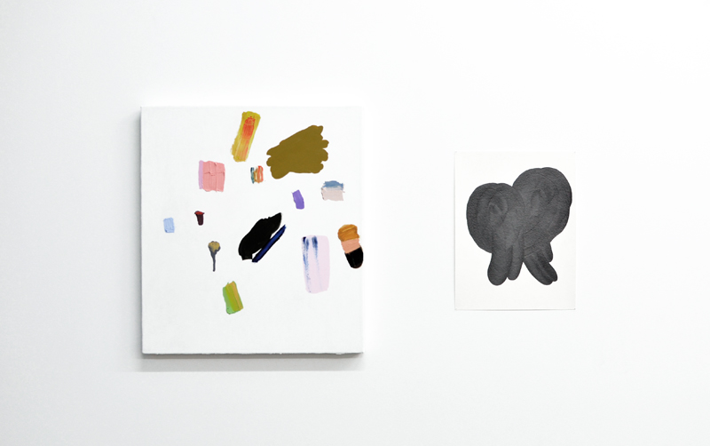
GLL: Amy, we spoke before about how you often work on the ground to get rid of the hierarchy of shapes and spaces. So, speaking of abstraction, my question is, how is orientation important to you in the final work?

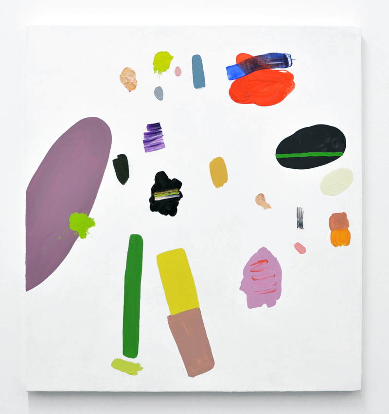
AB: I do work a lot on the ground because I don’t want the work to be affected by gravity. But, I think somehow these works still got a little affected.

PK: What exactly do you mean by being affected by gravity?

AB: Every time I work in a way that I exist in my body, with my feet on the floor and the work on the wall, I eventually start making the world around me. Things start to move to the bottom of the picture plane and all of a sudden, it’s like the real world, and that’s not what I want at all in this work. So, I have to work on the floor because gravity always seeps in. I don’t want to make the physical world in my painting, so I have to work on the floor.

GLL: So, you don’t want that horizon line...

AB: Exactly, well, not really a horizon line, but the way things are weighted, a top and a bottom, a right and wrong, an up and down. Even when I look at the work and make a decision while the work is on the wall, gravity happens again and confounds me. I don’t want my characters to be affected by those rules. Gravity is so inescapable, it turns out!

PK: It probably is like one of the most inescapable things!

AB: But you’d think in my painting it doesn’t have to exist, but it does, it gets in there. I have had people turn my paintings different ways. I think of them as being oriented a certain way, because for me they do something for me that way. I want to not care if it’s oriented in a different way, but I probably do.

PK: Yea, you probably do.

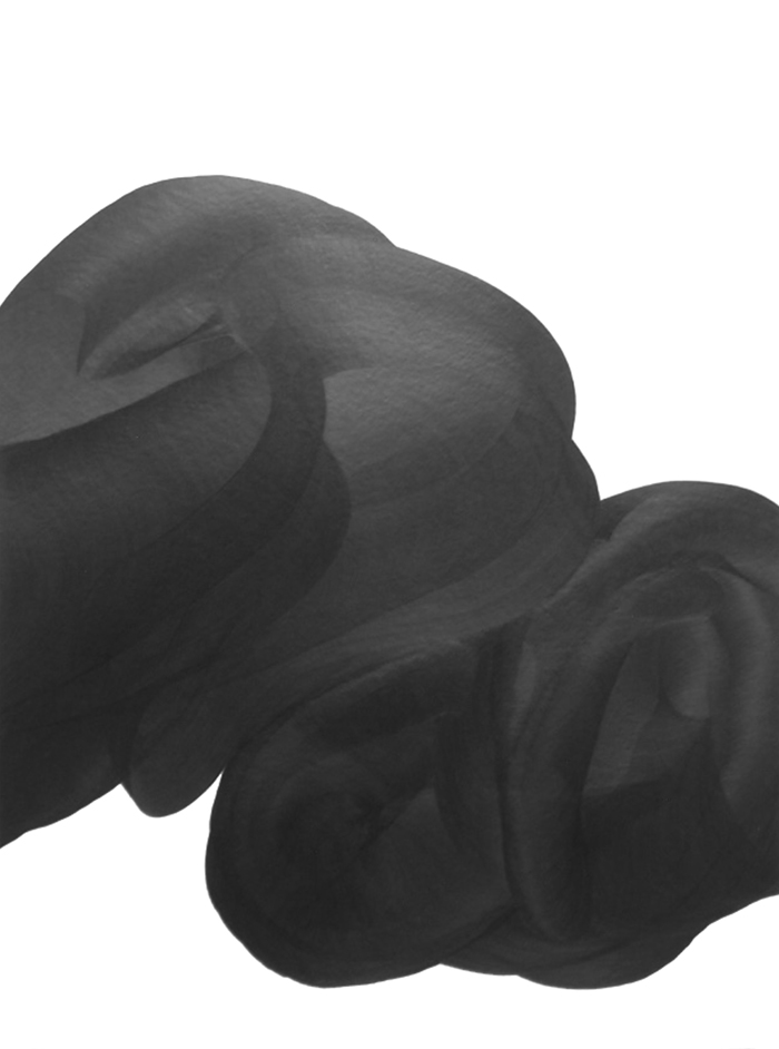
AB: Yea, I do. I read this wonderful idea that I want to take on as my own but I can’t because I’m just not being honest. You know there was that awesome aboriginal show over the summer (No Boundaries: Aboriginal Australian Contemporary Abstract Painting, presented by PICA) and those artists were like, “put this piece on the floor,” because the way that they orient space is just so fantastic, and they don’t cater or work in any of our western pictorial constructs of making a landscape to explain your experience at all, which I thought was the most fantastic thing in the world and which I wanted to do so badly. But honestly, I know someone who owns one of my paintings and has turned it a different way and every time I walk in the room I’m like “ehhh...that’s not right.” But, you put it in the world and it’s not yours anymore.

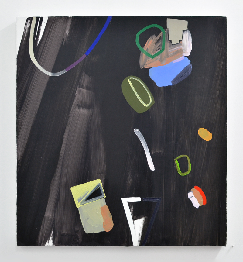
GLL: And Patrick, with your work you are definitely working on the wall.

PK: I am, yea.

GLL: Physically, it would probably be difficult to work on the floor.

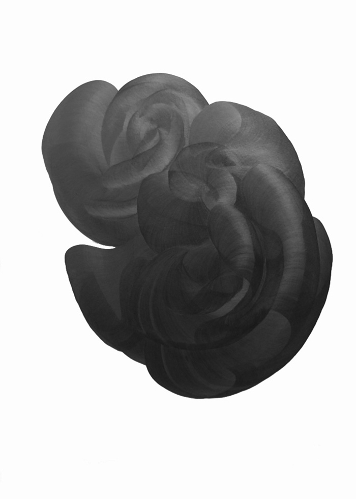
PK: It kind of would be, but honestly when I’m making these too, I am kind of twisting and bending so many different directions. It’s really kind of strange. Sometimes if I find my body in a stressful situation all of a sudden, I’ll switch to the other side and find another position. Once a work is completed, I’ve always enjoyed the fact that there is not one fixed spot in which to view it, for the fact that under certain amounts of natural light affecting it’s constantly changing.

GLL: Which brings us back to the idea of time.

PK: Right.

GLL: But in terms of orientation, you know from the beginning how a piece will be placed on the wall?

PK: Yea, I don’t ever really turn the page when I’m working. I haven’t really gotten to that point because I don’t know the reason why to do that, other than just to do that. Usually, I orient a page and say this is how I’m going to work, in this format. It’s interesting when Amy was talking about trying to rid yourself of gravity, because I’ve really tried to do that as far as keeping these images floating in space to almost feel weightless, outside of the fact that they also feel very heavy, very dense.

GLL: And these newer pieces on black paper, almost feel like a piece of a larger one or a zooming in.

PK: Yes, somewhat, getting a little bit closer in. Maybe a little more terrestrial. The black paper was really started as more of a curious thing of seeing what could happen.

Amy Bernstein, We’re Creatures of the Wind, 2015, oil on canvas, 20 x 20”, Private Collection //  Patrick Kelly, Traverse, 2015, graphite on paper, 15 x 11”

Amy Bernstein, We’re Creatures of the Wind, 2015, oil on canvas, 20 x 20”, Private Collection //  Patrick Kelly, Traverse, 2015, graphite on paper, 15 x 11”

GLL: This brings me to a question about Amy’s latest painting, with the black background, what are your thoughts on that newest work?

AB: I think after awhile you work in a certain way for a long time, I think of people like Morandi who painted still lifes his whole life and they are just so sublime, so fantastic, they hold something that is so otherworldly. This time that we are in right now is so fast, which I think is hard sometimes for making art because developing language is a slow, slow thing. I think I had the impulse, I need to not work on this white space because it is limiting me, but then I think about people like Morandi, and the fact that I haven’t even begun to even touch the surface of what could possibly be in this white space, in this sensitive void record, but I wanted to make something that filled the hole—and so I filled white with black.

GLL: Do you think it’s somewhere you’ll keep going?

AB: I don’t know, I’m not really good at knowing. I kept thinking about this the whole time making this work, that I just can’t get there in my mind. I can’t do it in my mind, I have to make the thing. It’s the only way to work toward where it will go, and I’m absolutely positive it’s influenced by all my ideas and thoughts about the world, but I have to make the thing to find out. Other people don’t work that way; they have a complete concept. But I don’t entirely believe that either. I don’t entirely believe in a watertight concept. I don’t think that works.

PK: I don’t know either, it’s hard to judge if that really is happening that way or not for some people.

AB: I have a sneaking suspicion though that with anyone who is making anything, that the transformation something goes through while it’s being made is probably pretty drastic. And then the end product holds so much more than anyone ever intended, especially if it’s a powerful piece of work.

Amy Bernstein, Untitled, 2015, oil on canvas, 24 x 22", Private Collection

Amy Bernstein, Untitled, 2015, oil on canvas, 24 x 22", Private Collection

GLL: The idea of darkness as a meaningful space, or a political space, has come up in a few of these artist interviews. I started thinking about your work, Patrick, and wondering if you think about darkness, and if so, what does that mean for you?

PK: Now, I don’t really think so much about the idea of darkness. Originally when I was conceptualizing these I was thinking about darkness and the void that exists there. Part of it is that staring into the abyss or staring into shadows of something that is void of light, like light of this physical world. What happens as you start staring into a void is that it becomes a reflection of yourself. You start looking at a picture plane that is not existing here, but feels real and you start creating imagery, creating shapes, you almost start creating light that is going to exist there. I feel that that part, where you get to staring, is actually pretty critical for us as humans, especially for our entire development from where we’ve started from to where we are going. There’s a part of me that feels it’s very necessary to have that, to have that bit of darkness. I think it has to be there.

Patrick Kelly, Untitled II, 2015, graphite on paper, 24 x 18”

Patrick Kelly, Untitled II, 2015, graphite on paper, 24 x 18”

AB: Which I think also goes back to the title of the show, you know. The liminal space is a dark one.

PK: It is definitely. In a way, those dark spaces are the places where you have to create what exists there because maybe there is nothing there at all, but you can’t tell.

GLL: There are many conversations going on between the two bodies of work, but the one thing that really stands out is the fact that both bodies give us that time and space, and it feels really generous. It’s work that the more time you spend with it, it keeps changing, keeps giving more.

PK: I definitely want people to consider it that way, because it is such a long journey for myself, moving physically from one piece to the next. People can’t be there with me while I’m making the work; they can’t be in that mental space, but hopefully the images encourage an experience that opens them up to these ideas.

AB: That is definitely the goal. As someone who feels that way about the work that I look at, you know, that it’s work I feel like I will look at for my entire life, that would be amazing. That’s like, my life’s goal for my work, what I would want, something someone would want to come back to. That would be amazing.

Post-interview follow-up question with May Barruel (Nationale owner/director)

GLL: How did you arrive at the idea of pairing Amy and Patrick's work?

May Barruel: It was one of those moments when I was laying in bed, either had just woken up or couldn't sleep, and I had a vision of their work being paired together. I've always been drawn to how sparse both of their work is, how minimal and yet intense, and I wanted to put that vision into reality in a gallery setting. As different as Amy's bright colors and Patrick's blacks and greys can be, I had a sense that their work also had a lot in common. I was attracted to both the stark contrast, and the similarities of their work, and wanted to see where that conversation could take us visually.

Once we started planning for the exhibition, I knew it would all come together because of their shared enthusiasm and dedicated studio practice. From the start, I always envisioned that Amy's and Patrick's pieces would be paired together in the gallery, for the public to see that conversation, as opposed to grouping each of their work in two different areas. I couldn't be happier with how the show turned out. It has infused the space with a sense of both calm and euphoria.

That's all for now—thank you Amy, Patrick, & May!

That's all for now—thank you Amy, Patrick, & May!

GG AT THE HELM: PORTLAND WOMEN'S FORUM curated by MIDORI HIROSE

Join Midori Hirose and these other amazing women artists this Sunday, November 15, in the Columbia Gorge for GG at the Helm! More info below.

With a Bronco Gallery tailgate invitation in hand, Midori Hirose returns to her familial Oregon roots and would like to take you on an Oregon expedition via curatorial investigations this Sunday, November 15th to the Portland Women's Forum (the viewpoint which overlooks the gorge and Crown Point, 30 minutes from Portland.)

Presenting GG at the Helm. An exhibition of visual, music, performative and written works at the Portland Women’s Forum from 3pm till sunset with: Julia Calabrese, Mia Ferm, Jennifer Keyser, Lola Milholland, Patricia No, Antonia Pinter, Lisa Radon, Morgan Ritter, Stephanie Simek, and Mary Sutton.

GET YOUR BIDS ON!

So proud of our 8 represented artists (+ Jeffrey Kriksciun) for their generous donations to the upcoming Disjecta Auction happening next Saturday, November 14. Start bidding now via Paddle8 for the pieces featured on the live auction and see you in a couple weeks for the big night...

AMY BERNSTEIN & PATRICK KELLY // reception this sunday

On view October 21–December 4, 2015
Opening reception Sunday, October 25 (2–5 p.m.)

The work of Portland-based artists Amy Bernstein and Patrick Kelly may at first glance seem like formal contradictions. While Kelly's thick layers of graphite depend on countless passes of his hand to achieve their silky depths, Bernstein's colorful compositions herald the immediacy of her gooey medium. And yet, their processes abound in a shared ritualism. Exhibited together at Nationale for The Liminalists, the two may be seen to similarly tease the standard behavior and limits of their given mediums (painting and drawing, respectively) in the attempt to create a new language. For both, the act of creation—rife with introspection and indeterminacy—thrives on the unfamiliar. Their images are disoriented and rebuilt over time, forever questioning the limits and givens of perception.

Specifically, within Bernstein’s practice, painting’s hierarchy of color and composition is routinely upended. Placed in what appear as haphazard configurations upon a slick, white background, her colorful blobs and geometric shapes float unconstrained by the two-dimensional surface. This illusion of randomness and detachment enables Bernstein to orchestrate a pause within her audience. Her sparse works beg the viewer to confront their ideas of a visual status quo. Her palette and layouts, while seemingly accidental, are, instead, deliberate examinations of cultural perception, design, and visual construct.  

Kelly’s Carbon Traces series similarly challenges space in order to manipulate perception. Using hand-cut forms to trace an initial design, he then continues to move the stencil ever so slightly in order to widen the image. The result of this laborious repetition is amorphous and seductive. The graphite that Kelly uses subtly absorbs and reflects light, thereby invigorating the drawing with an atypical sense of sculptural depth. Meanwhile, the line of the individual contour merges through endless reiterations into a new object, a distant, haunted trace of its original state.

BIOS
Hailing from Atlanta, GA, Portland–based artist and writer Amy Bernstein received her BFA from the Rhode Island School of Design in 2004. Her work has been exhibited in Portland at Nationale, the Littman Gallery, Portland State University, Car Hole Gallery, Worksound, and Carl & Sloan Contemporary. She has received grants from Creative Capital and the Warhol Foundation in 2010 and from the Regional Arts and Culture Council in 2012. She joined Nationale as a represented artist in the summer of 2015.

Patrick Kelly is a practicing artist living in Portland, OR. He received an MFA from The George Washington University in Washington DC in 2005 and a BFA from East Carolina University in 2001. He has shown in Seattle, WA, New York, NY, and in Portland, OR, at Worksound, Basil Howard Gallery, Half/Dozen, and Autzen Gallery. Kelly’s work is included in collections at the MoMA Library, New York, NY, the Bieneke Rare Book and Manuscript Library, Yale, New Haven, CT, and the Oregon Arts Commission.